June 2020 – June 2021
Product Detail Page – Category Experience
A design-led project intended to influence the future of product presentation at Zalando. We were asked to explore what category specific product presentation would mean for our customers and Zalando. I led the project working with other designers and product managers from discovery through to design.
Outline
Problem statement: “How might we enable customers to make a confident purchase decision on our Product Detail page? With several strategic work-streams starting up in 2021, how can we enable their teams and initiatives to contribute to the Product Detail Page and create relevant and rich category specific experiences.”
Vision & strategy
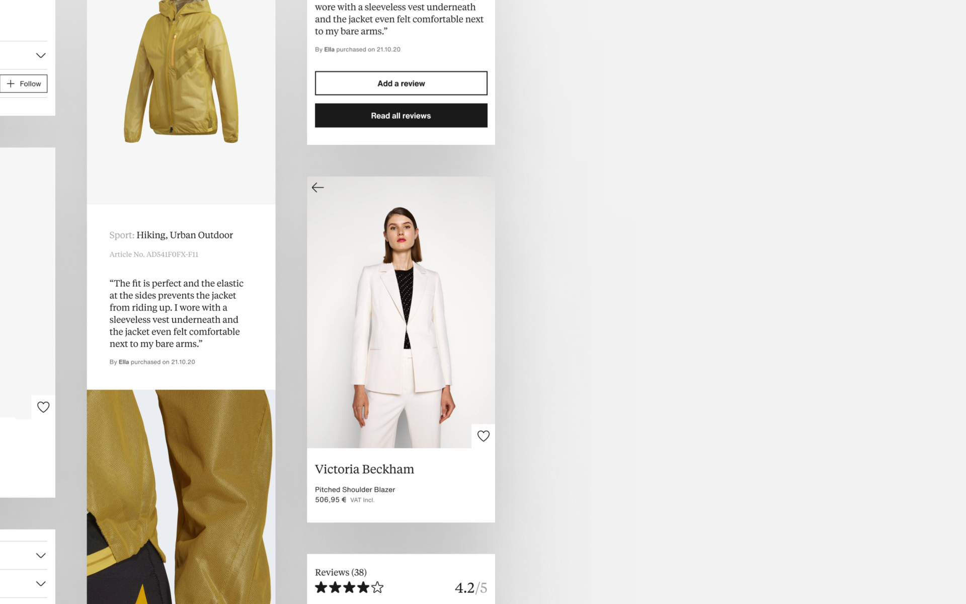
When a customer shops for skin care, they should have an experience that is highly credible, curated and specific to that category. An experience that they would trust as if it was from a brand’s own site, matching those levels of credibility.
Furthermore, customers should have a different experience to one they might have shopping for sneakers. We need to provide diverse but tailored and specific category experiences that still remain recognisably part of Zalando.
Measuring success – Credibility & returns
Today, customers struggle to make lasting purchases with return rates high for more premium products, Zalando struggled to connect with our customers beyond choice and convenience. Zalando also had issues with credibility in certain product categories, they wanted to showcase the expertise it has across as many categories as possible. Tailoring product presentation on PDPs was intended to boost Zalando’s credibility in certain categories so that customers think about Zalando as their first port of call when looking for a specific product.
50%
Size and presentation returns
We can see we are not matching our customer’s expectations when it comes to product presentation – we can improve this by providing more accurate, relevant and informative descriptions.
25%
PDP bounce rate
The percentage of customers leaving straight away was a sign that we were not presenting products in a compelling way and not matching customer’s expectations.
60%
Logged in users with empty bags
Improving conversion here could validate Zalando's new found credibility, improving the category experience was a big opportunity in this respect.
Process
00.
Our current appoach
How do we present our products to customers now? How do we manage and maintain product presentation standards at Zalando's scale?
01.
Competitor & comparative study
How do brands and retailers approach this problem and present products across a range of categories?
02.
Expert interviews
What knowledge does Zalando possess and what opportunities are we missing? How can we leverage what we already have?
03.
Glossary definition
Defining the anatomy through a shared language was key to sharing knowledge internally and building a stakeholder’s trust.
04.
Build a framework
Moving away from templates to a modular, tile based approach afforded us the flexibility to explore tailored experiences per category.
05.
Prototype & user testing
Early feedback from customers was key to confirming our assumptions and providing valuable insights.
06.
Creating a shareable framework
Providing scalable documentation to be used and understood across multiple product teams whilst delivering a tailored category experience.
00.
Templates – Our current approach
Zalando uses a single page template with only small variations in tiles for all categories. Therefore, we struggle to provide relevant customer experiences and to appear as a credible expert across multiple categories.
Products are presented in a functional and reliable way, our foundation is good but we fail to highlight product details specific to a category. As a result, customers struggle to find information about products from our PDPs, contributing to low customer satisfaction, high bounce and return rates.
01–02.
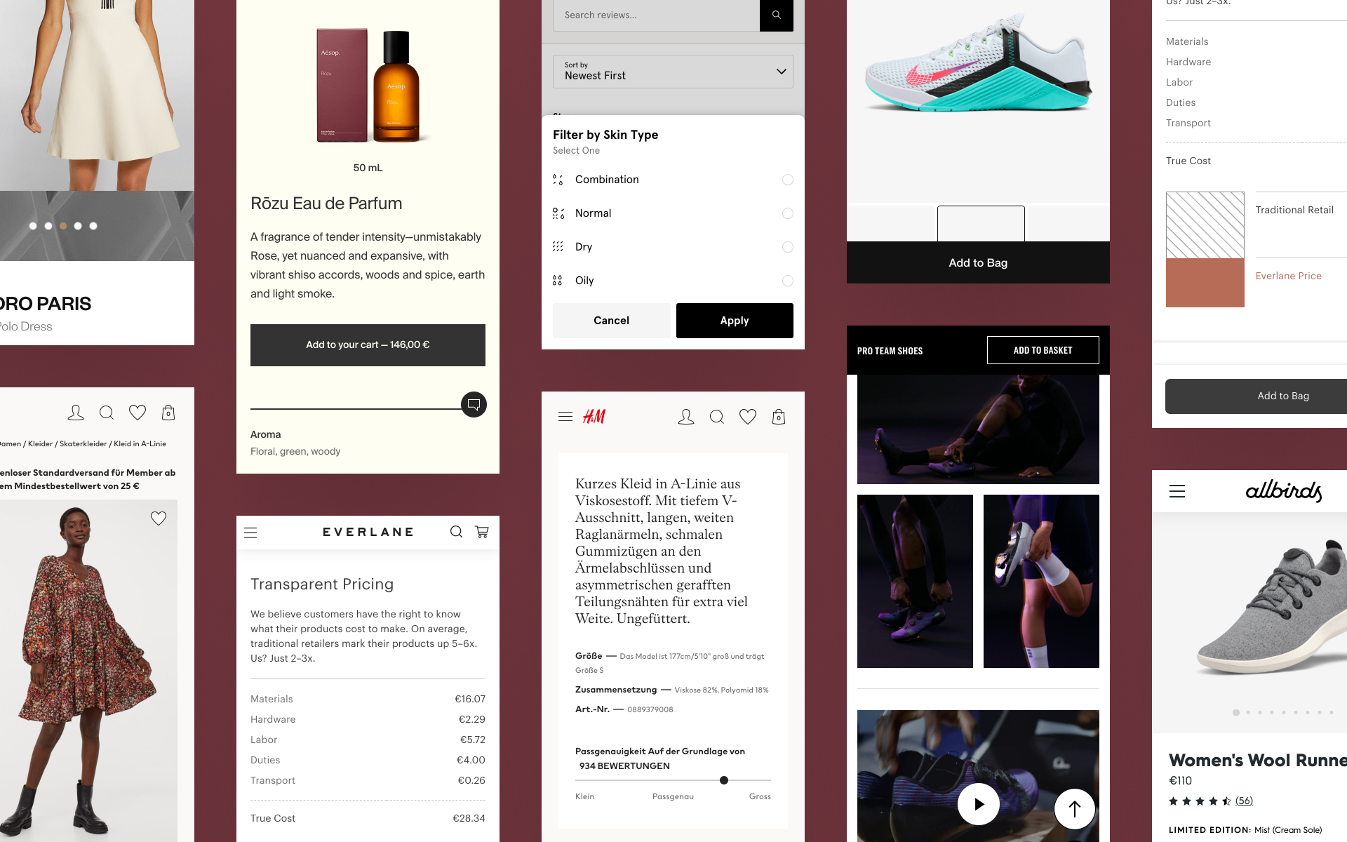
Competitor and comparative study and expert interviews
We looked at strengths, weaknesses and opportunities to identify commonalities and gaps within brands and retailers. What similarities and differences are there across different categories?
Our competitor study and analysis overlapped with the expert interviews, glossary and framework definition as we discovered other sources to research from our interviews and feedback sessions.
High level analysis
Brands are stronger at presenting relevant and distinct experiences to their customers. In many categories, they leverage that distinction with storytelling helping them appear as experts. Zalando does a good job of covering the basic needs of our customers, doing just enough to meet our customers’ functional and educational needs.
03.
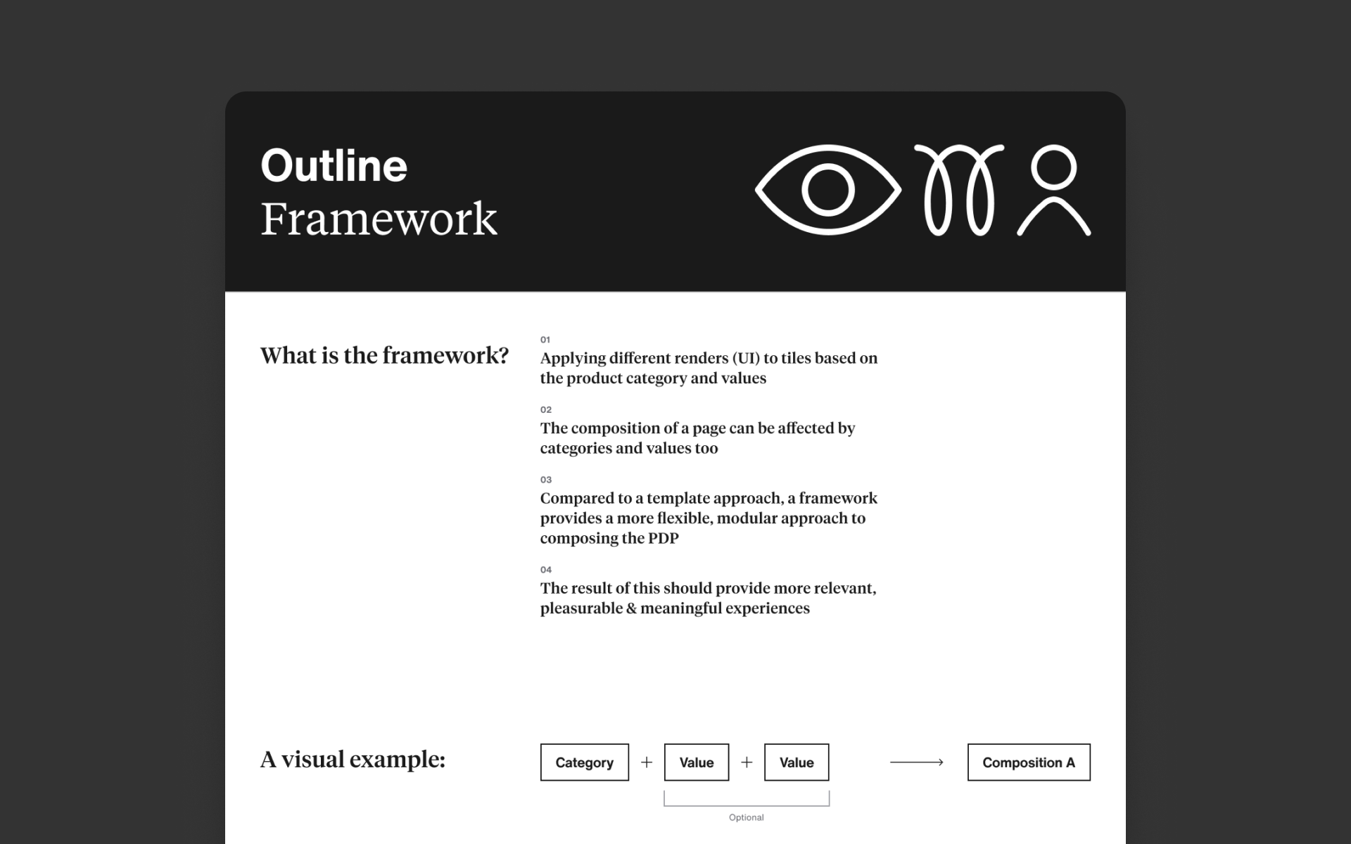
Glossary definition and building a framework
Our competitor analysis, stakeholder interviews and team discussions showed us that we needed to define a shared language for our proposed modular approach. A glossary of terms allowed us to be much clearer with our stakeholders and product teams. Prior to the glossary, we found it difficult explain the overall concept to different groups, slowing our ability to bring more sponsors on board and receive more internal support.
Working glossary
Component
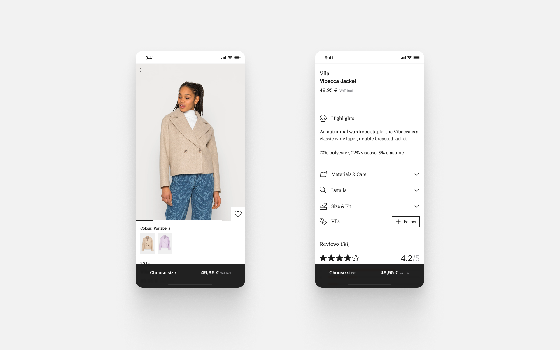
Individual UI components such as buttons, icons, drop-downs. Can be group together to build tiles.
Tile
A group of UI components make up a tile, for example; reviews, image gallery, product details section.
Render (new)
The visual composition of any UI element, renders can be applied differently depending on the product content, category or value.
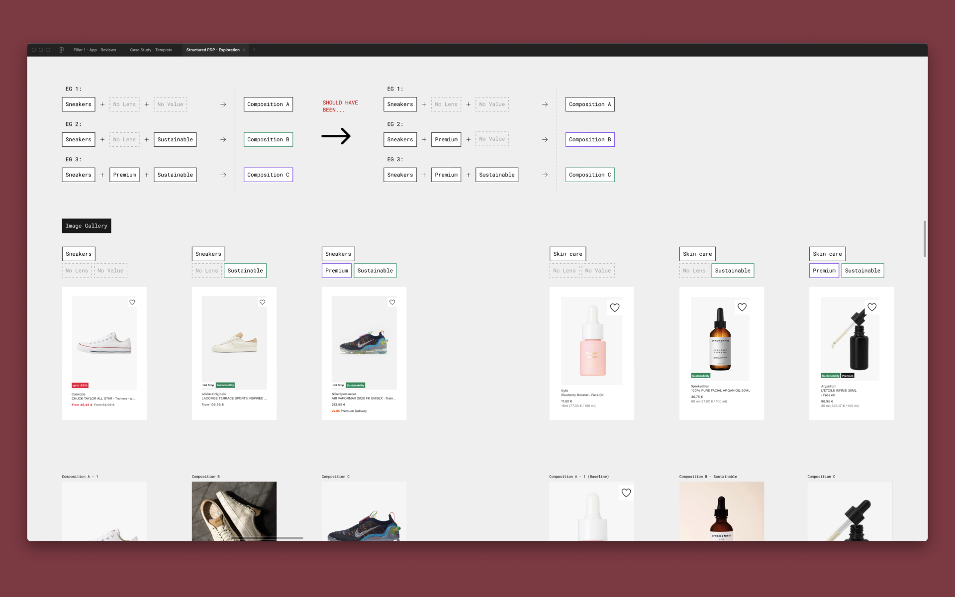
Category
The established way that we group our products by shared or similar characteristics, e.g. shoes, dresses, jackets etc…
Value (new)
Used to describe a product’s characteristics, e.g. Designer, Sustainability and dictate its composition, look and feel through UI.
Composition (new)
The order in which tiles are presented. This order could change depending on the category or value determined by the product.
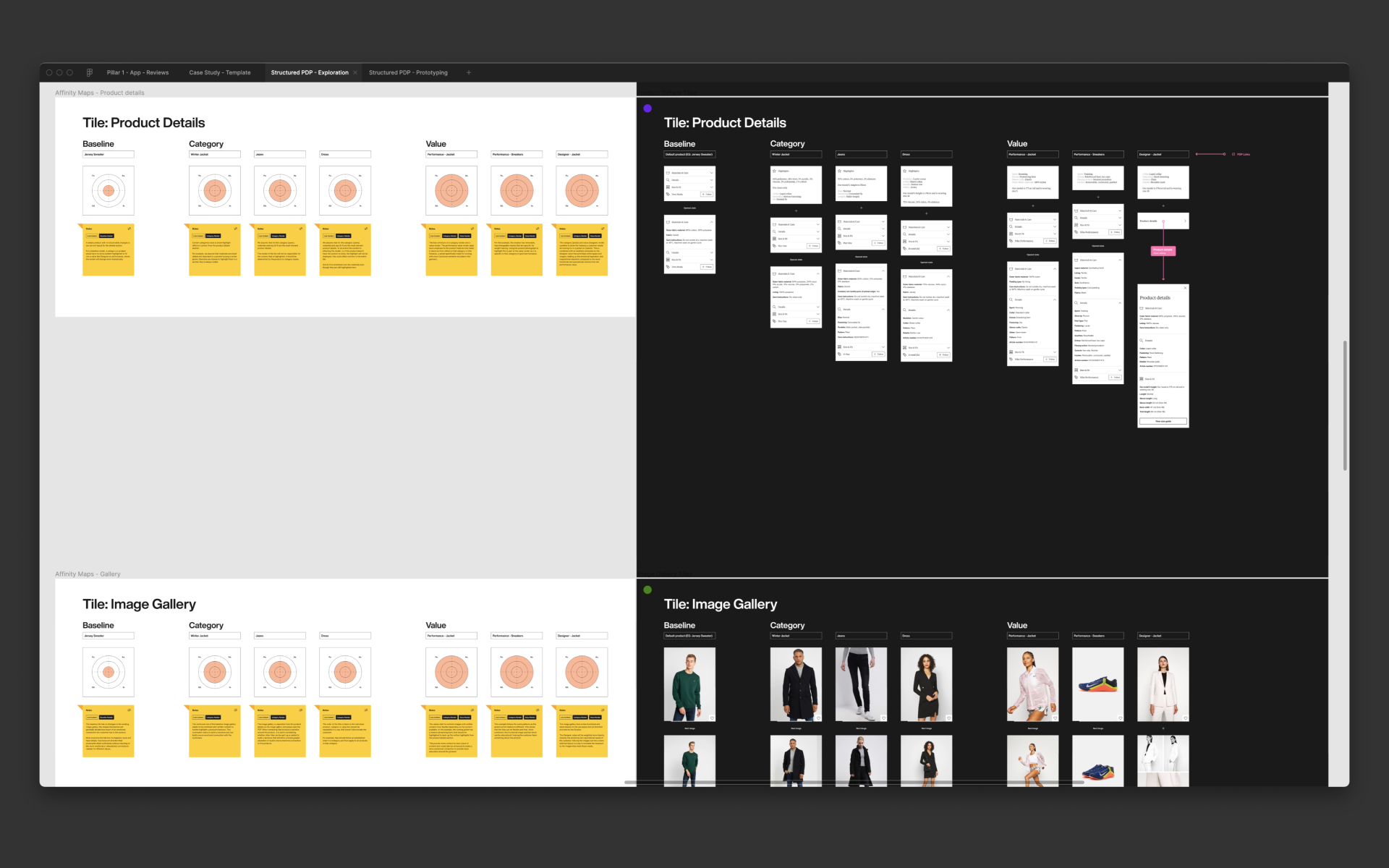
04.
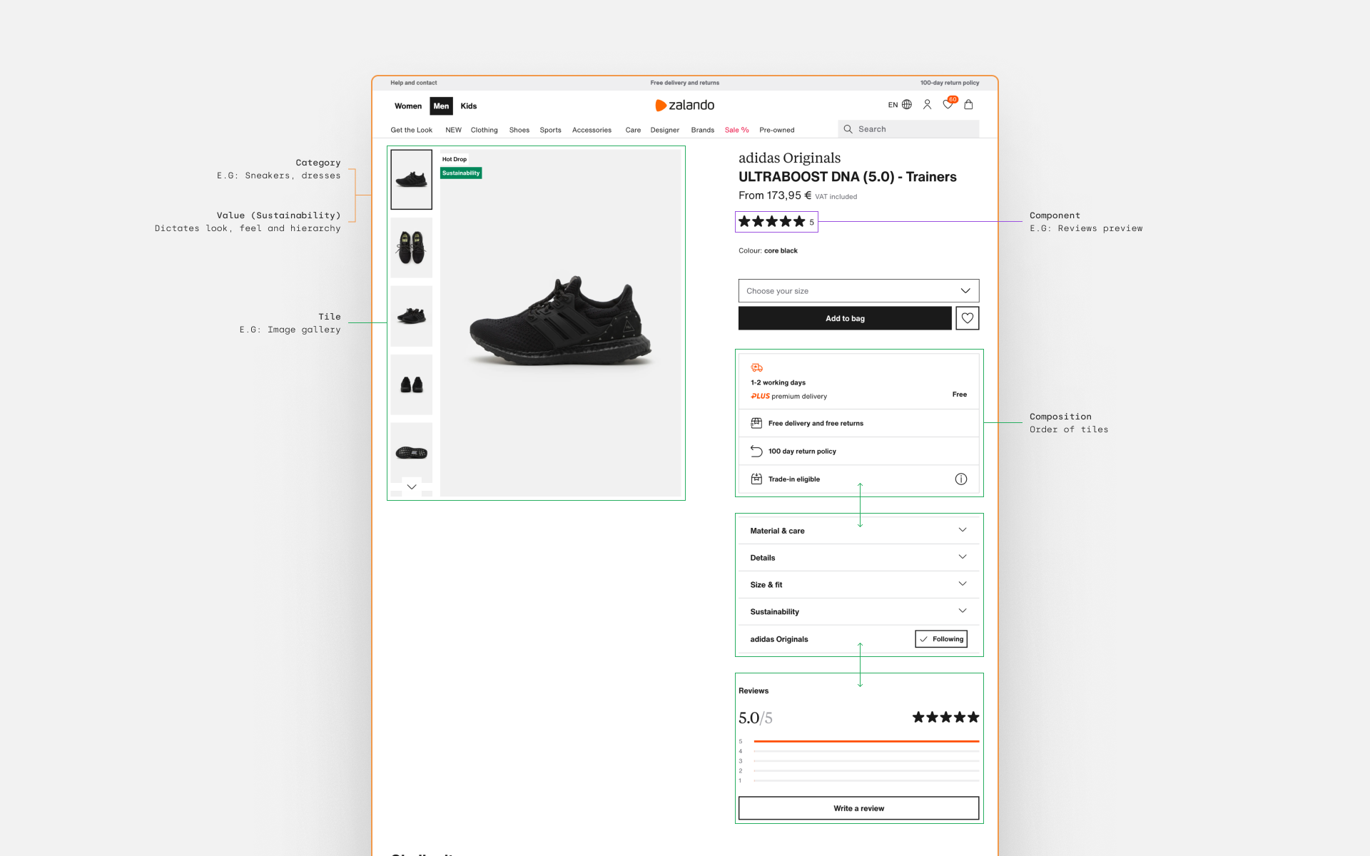
Building the framework
The images above show the breakdown of the existing PDP and a potential method tagging components or tiles. This method would allow variables to be applied based on the available product information and content and then define the look and feel (render and composition).
A PDP’s composition will be effected by the level of product information, its category (Jackets, shirts, dresses etc.) and if it has any “values”, e.g. if it is a sustainable or performance product. Each of those aspects will determine how the components and tiles on the page are presented and the order in which they appear. In theory, a PDP will automatically build a modular, tailored composition from different renders of tiles and components from the product information and its category.
Exploration
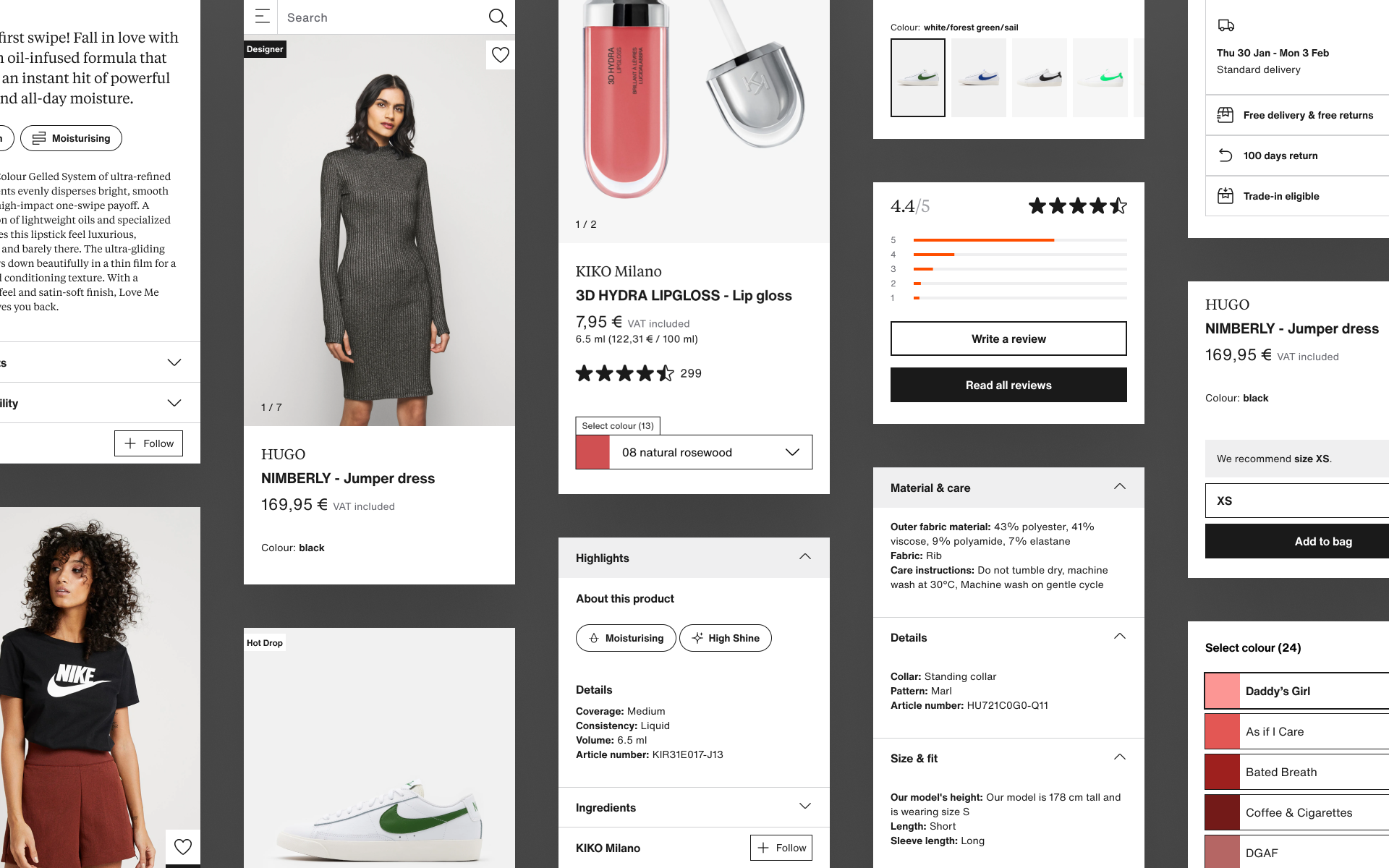
Now that we had established a theory, we experimented with different information hierarchy to see how the page would be affected between different categories (jackets, shoes) and horizontal values (designer, performance). We used ‘live’ products that we felt could be presented in a more compelling way and played around with different ways of presenting images and text, trying to push the Zalando Design System in the later stages to see how far we could push each composition.
One of the biggest challenges was changing the page composition without disorientating the user if they move between different categories. At this stage of the project we knew that the modular approach would be our best bet of solving that problem as you could keep the page recognisably Zalando, but enhance specific tiles and change the hierarchy enough to provide a tailored experience.
How can we create a tailored experience per category and value without disorienting the customer?
05.
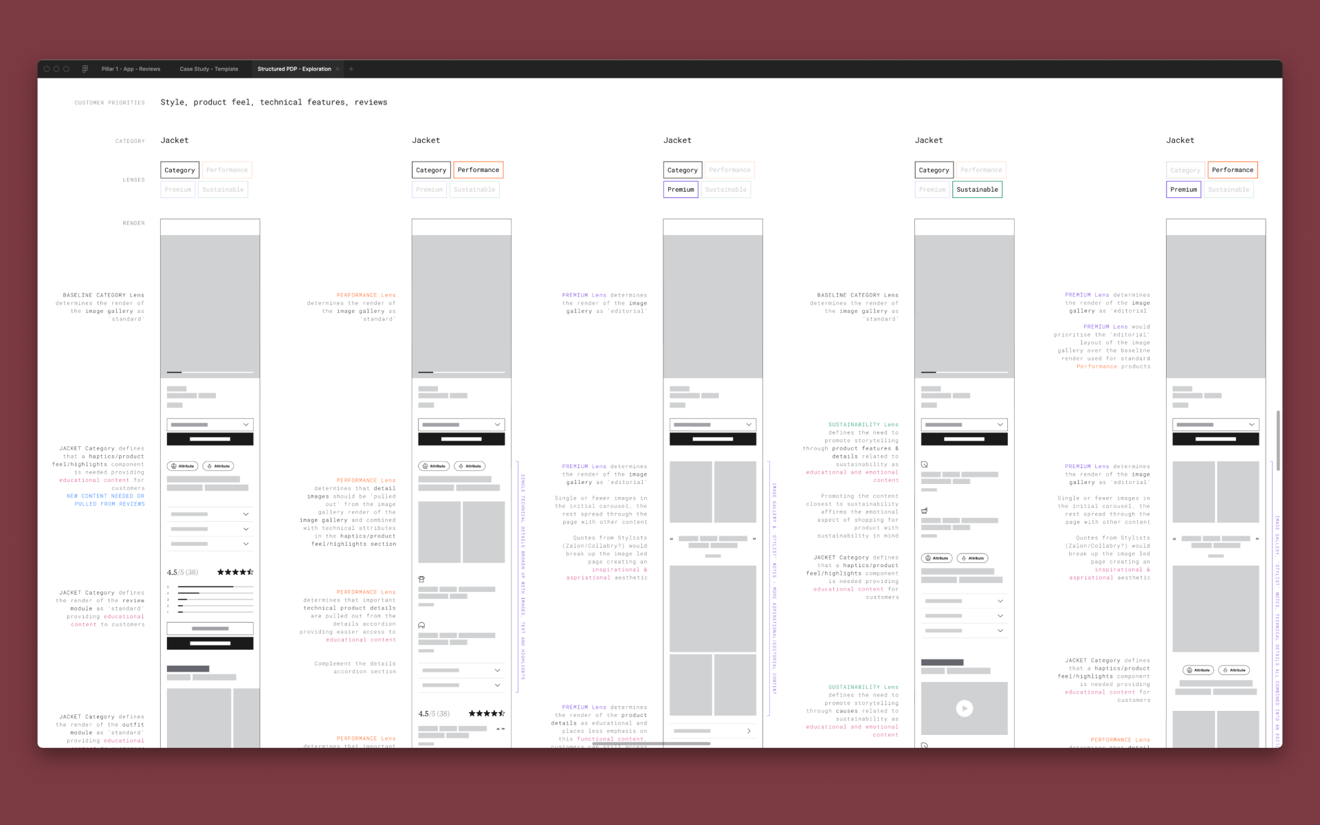
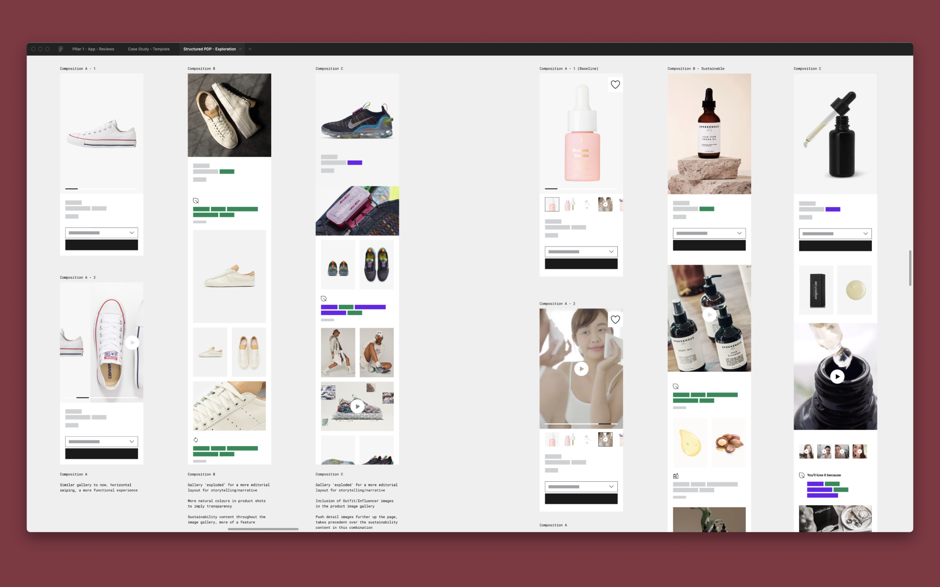
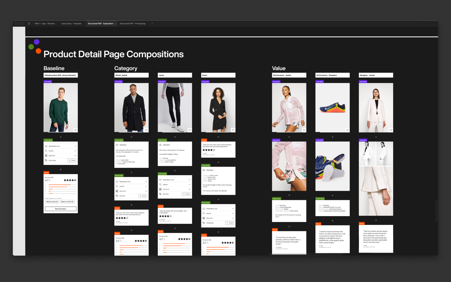
Prototyping & user testing
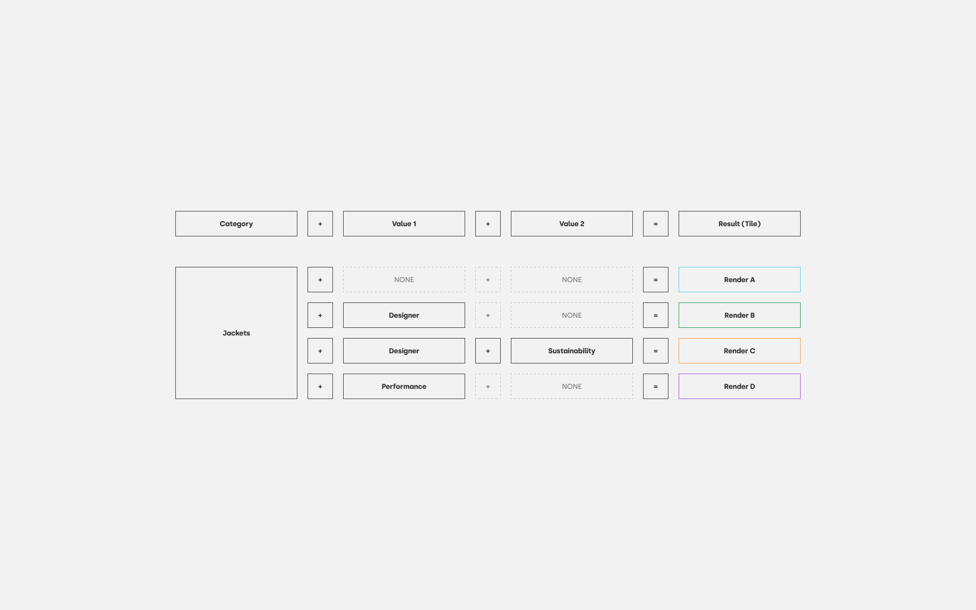
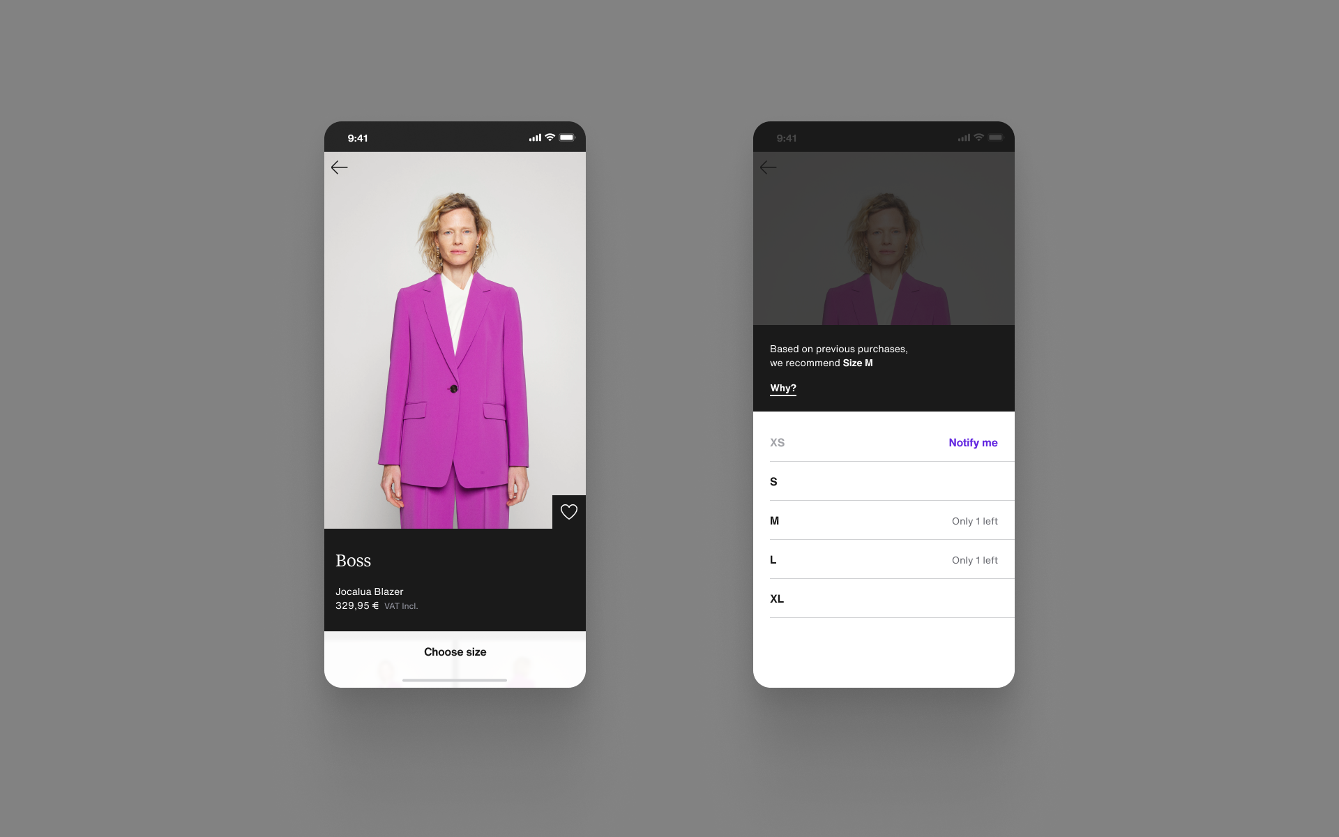
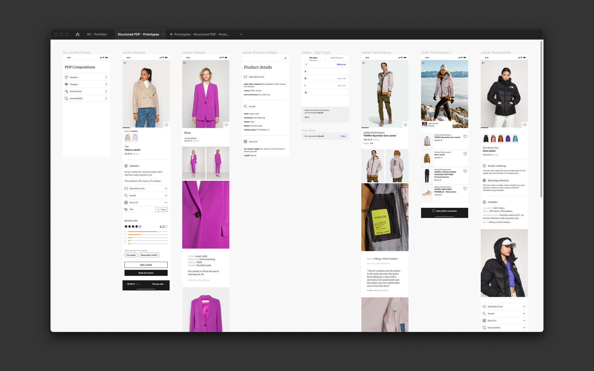
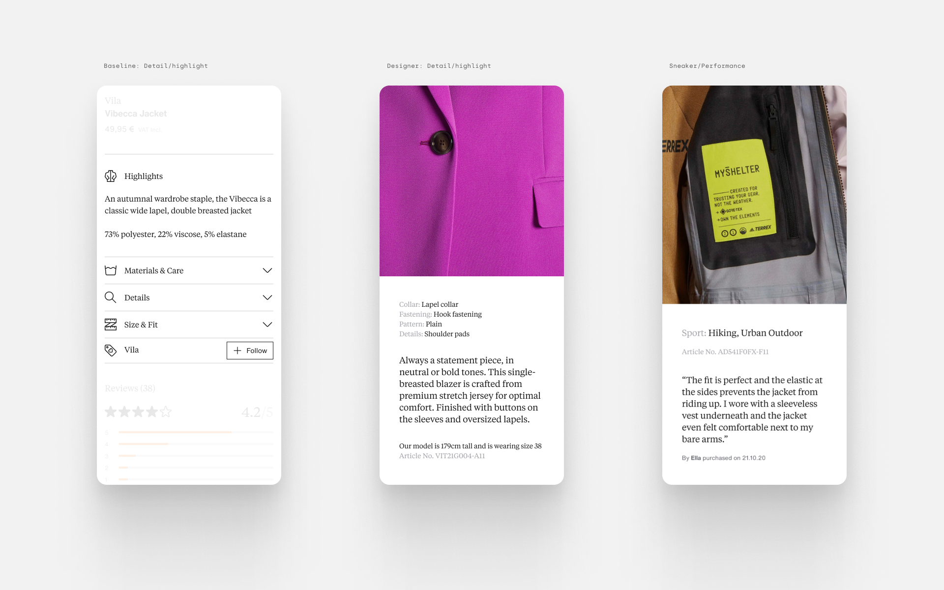
We tested the framework using one category (jackets) but with several values; baseline, Designer, performance and sustainability. Each value has an impact on the render of tiles and the composition of the PDP. Baseline would use the minimum amount of content and is more representative of items on Zalando with high turnover and low re-stock, with the other values having more detailed and specific information available for product presentation.
Testing the framework
Using live product data and images, we tested the framework using one category (jackets) but with several values; baseline, Designer, performance and sustainability. Each value has an impact on the render of tiles and the composition of the PDP. These concepts focus on the product data and three tiles; image gallery, product details and reviews.
Test compositions
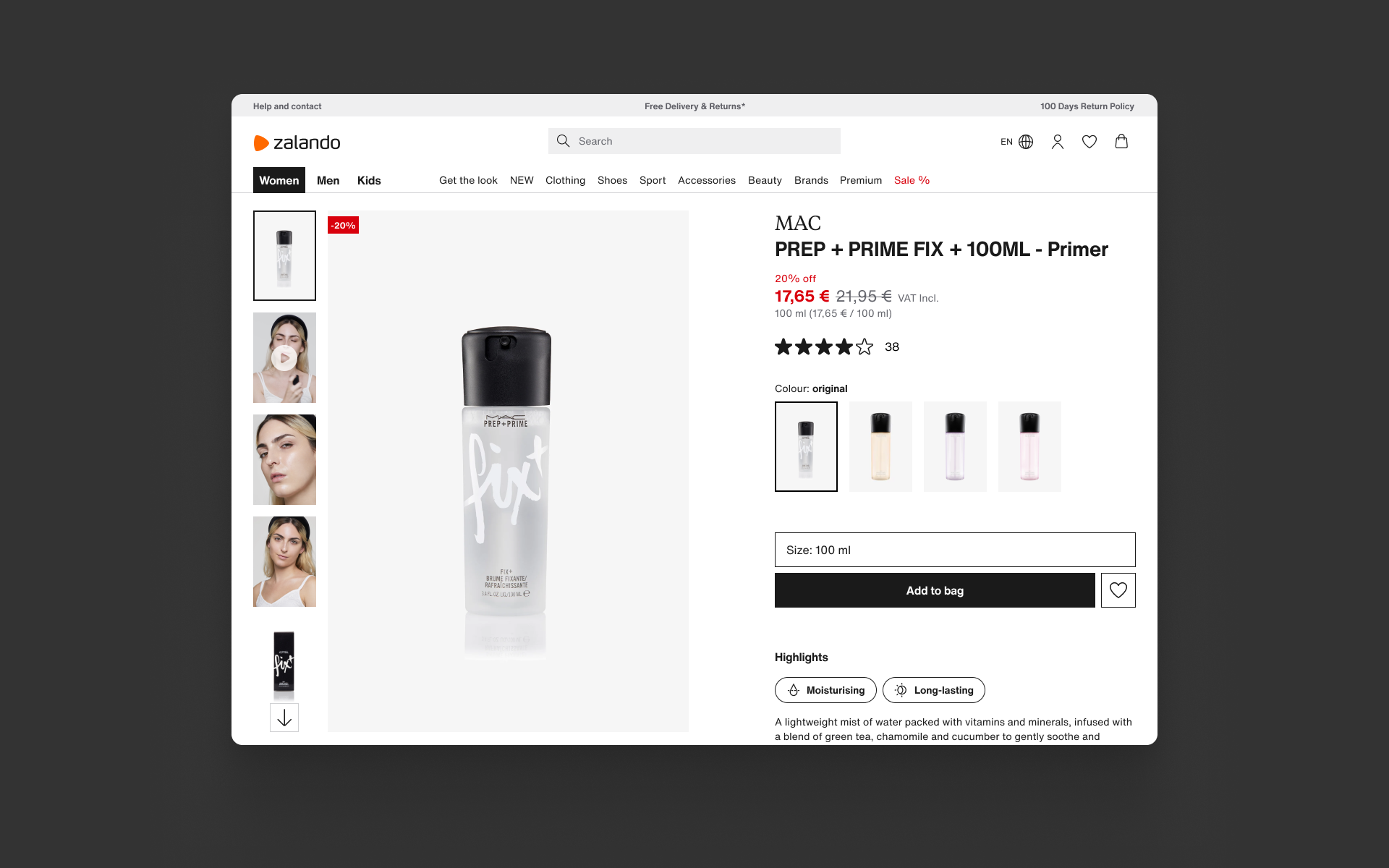
1: Baseline
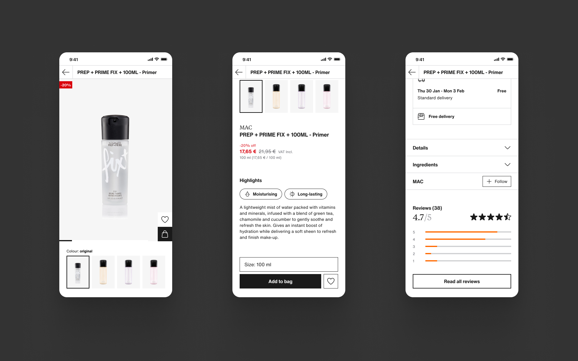
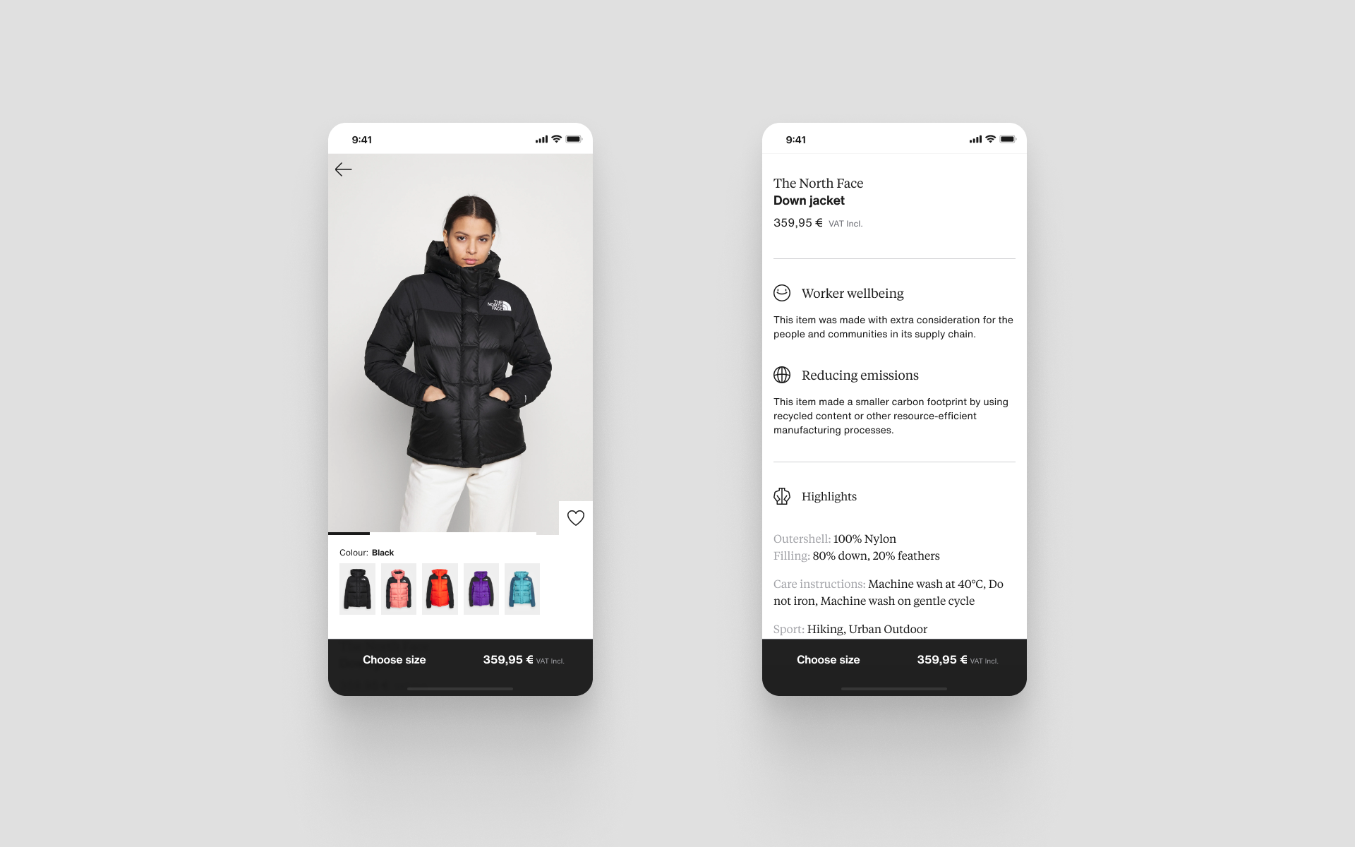
This render is more functional, each tile displays the core content needed to provide the reliable and usable foundation we will apply to all products on Zalando. We know that changes still need to be made determined by the category, e.g. highlighting materials.
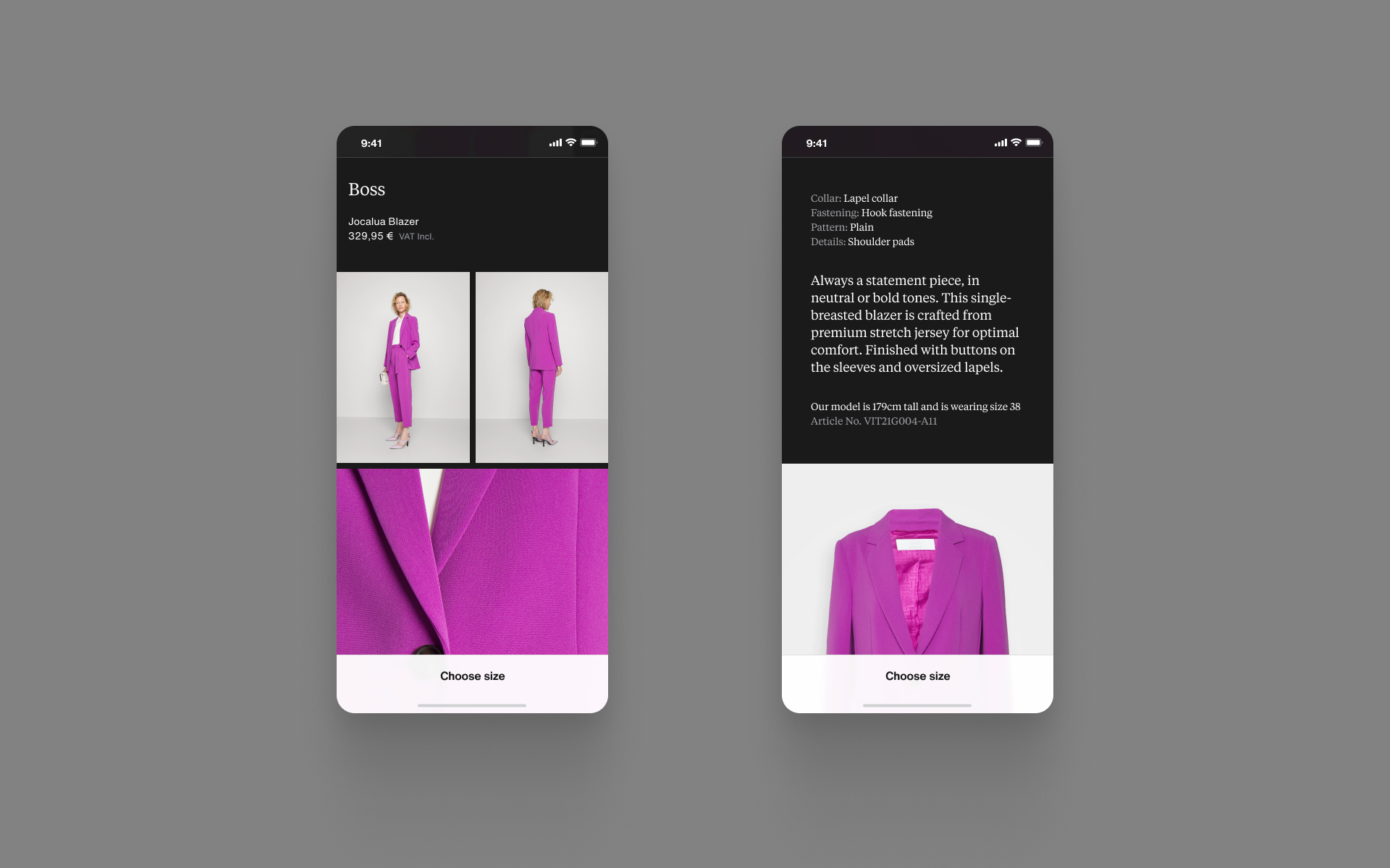
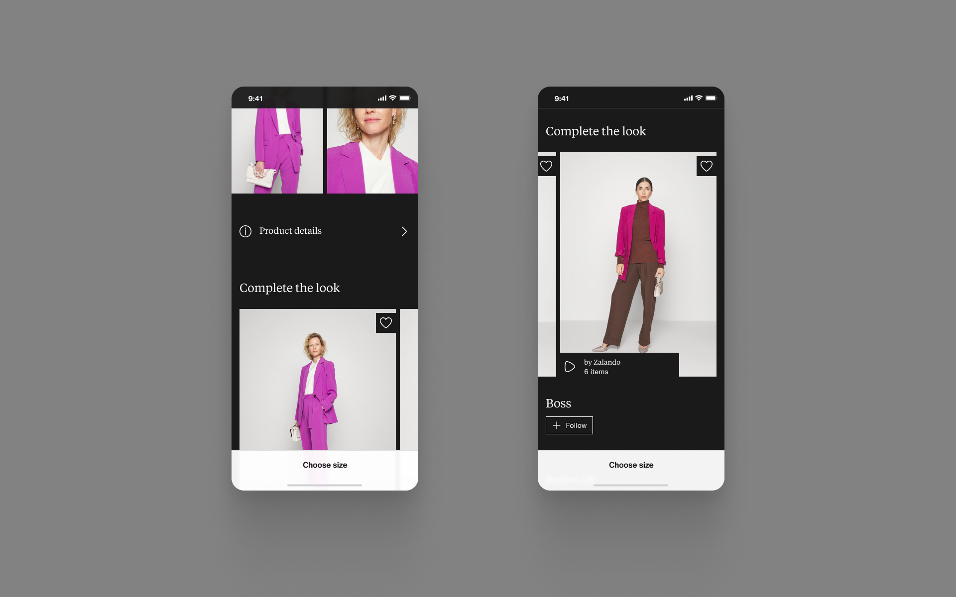
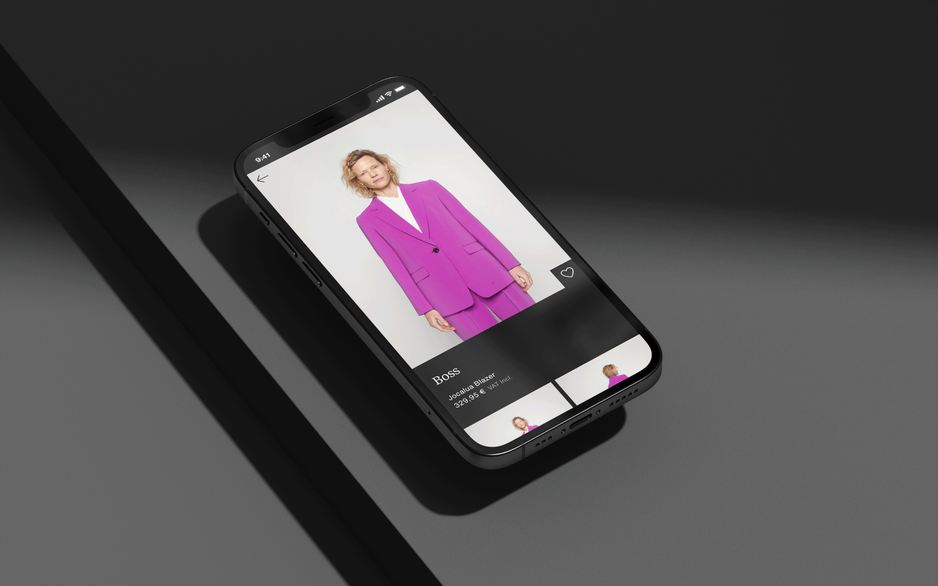
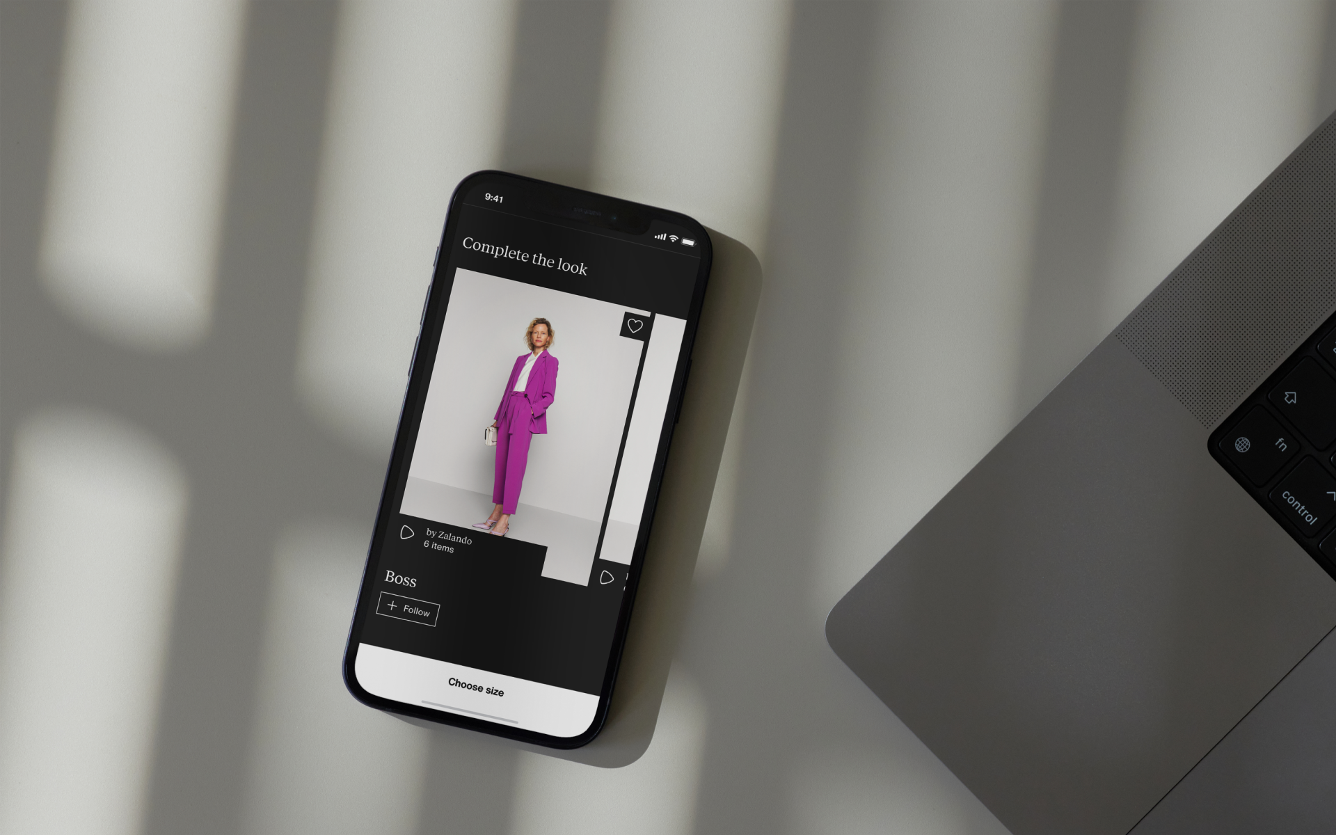
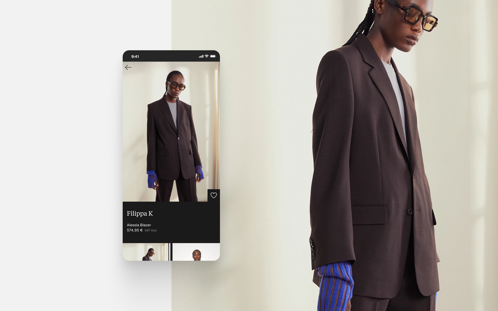
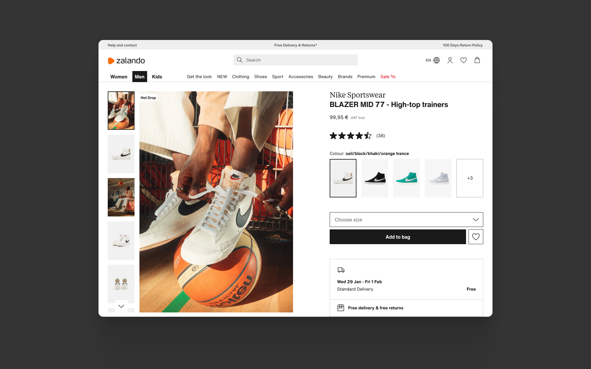
2: Designer
A much more inspirational composition that is appropriate to the Designer value. The image gallery tile is expanded and takes on a more editorial layout with the rest of the tile renders. For example, the reduction of the reviews content is designed to keep a curated look and feel.
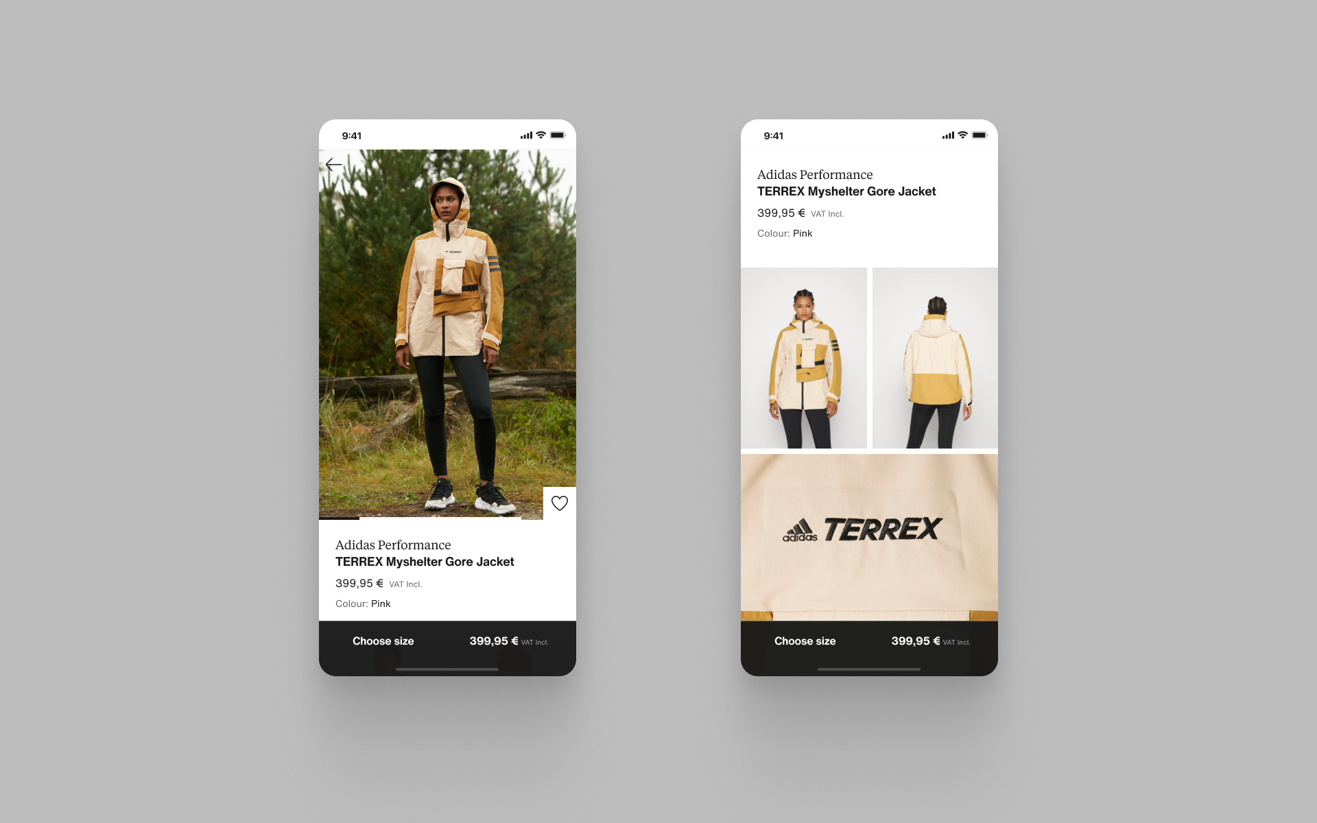
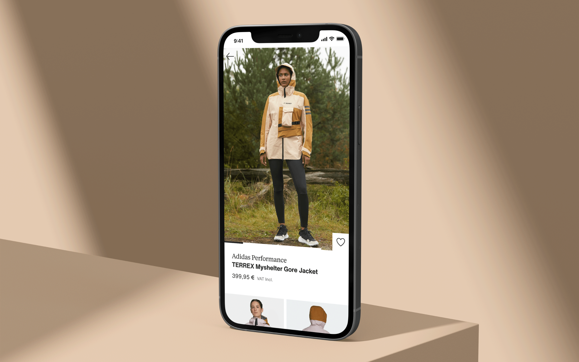
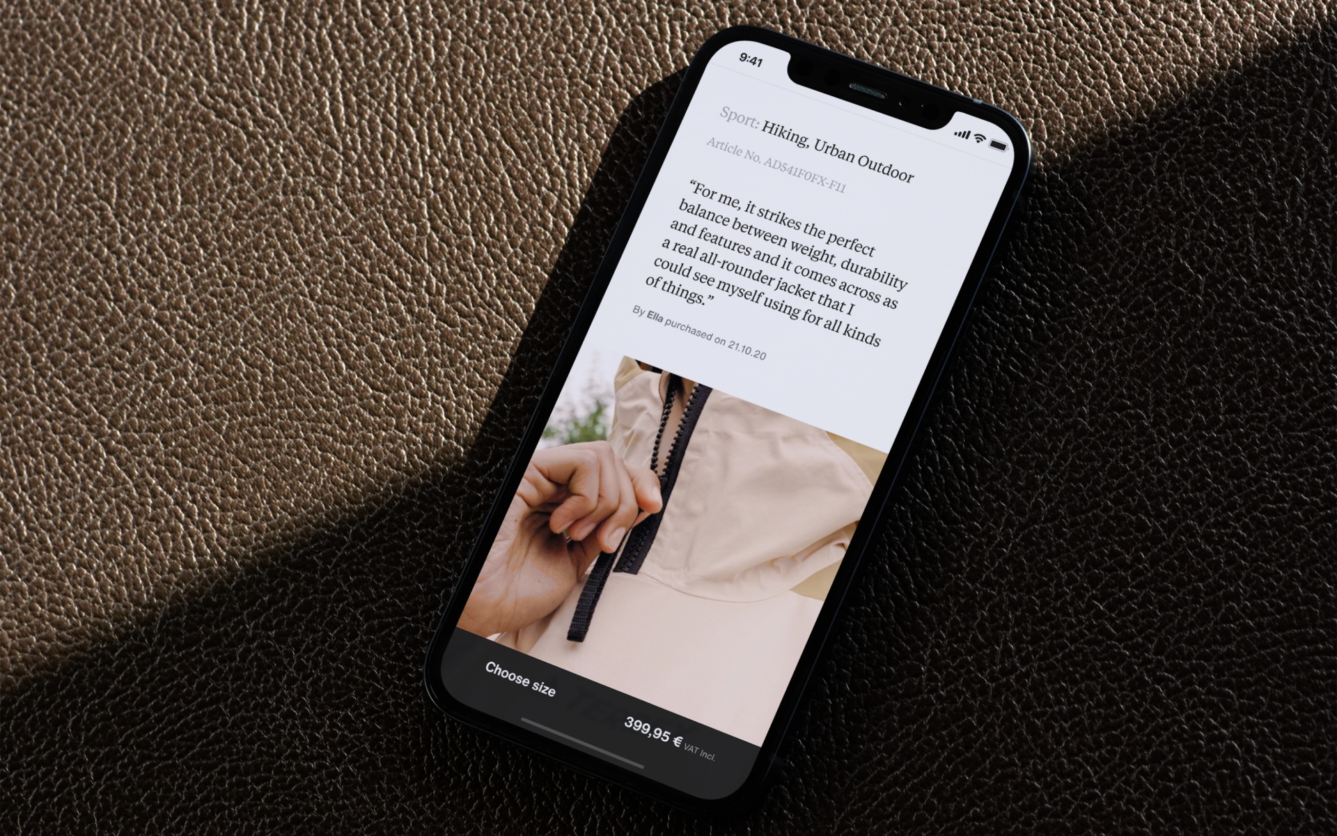
3: Performance
A mixture of functional, educational and aspirational content is presented to meet the customer needs within this value. We expose technical imagery and matching written content in new tile renders to show customers everything they need to evaluate the product.
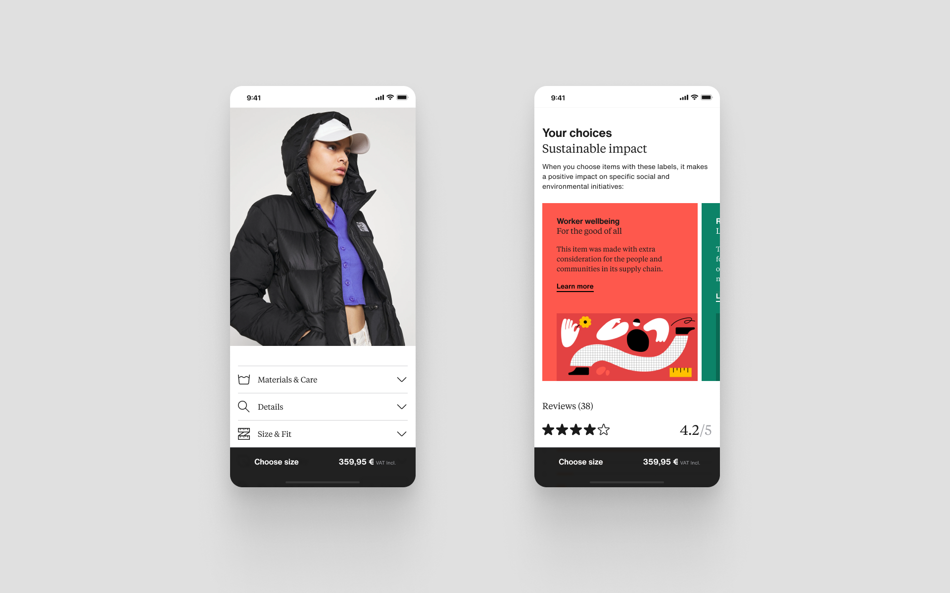
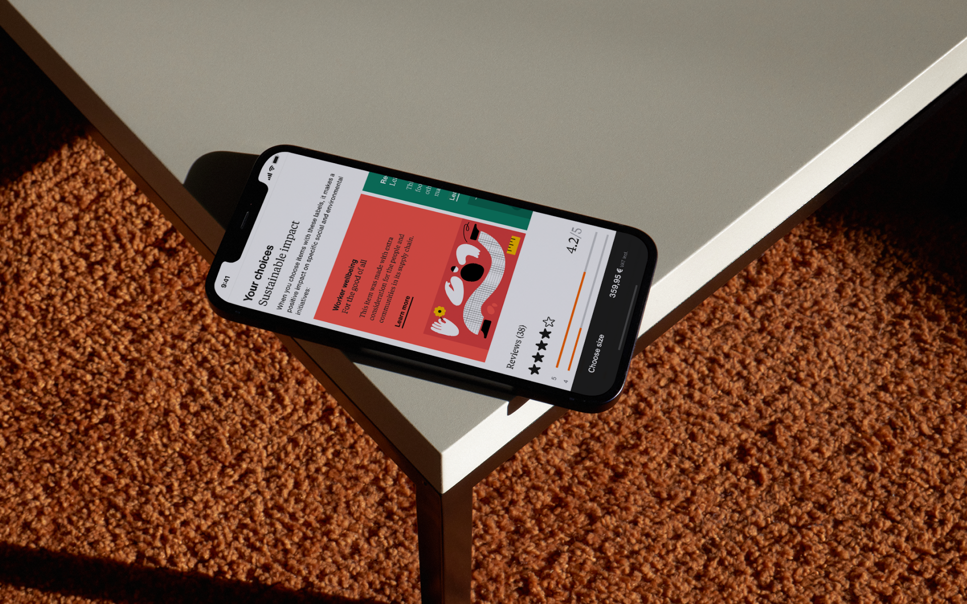
4: Sustainability
Customers demand transparency and credibility within this value, adjusting the composition to lead with ‘causes’ content helps us meet this need. We still need to meet the category needs, so we highlight material and care instructions as we should do for all jackets.
User testing
Introduction
After we had established a framework with prototypes ready to go, we tested four different products from the same category but very different purposes. The goal was to observe how our customers might respond to the different renders and compositions, and what the customers’ preferences were. We wanted to see how viable it might be for Zalando to have more than one template across different categories. We ran a moderated user test of the four test compositions with six customers to understand whether the changes we proposed would have the desired impact.
Research goals
Understand the impact of the different compositions and renders, and see if they would disrupt the current experience [limit risk]
Understand whether the different pages are positively perceived [assumption validation]
Understand if customers are able to find the necessary information within the new and changing PDPs [assumption validation]
Research questions
How are the changes to the PDPs understood by the user?
How do users perceive the different structures on each PDP?
How do the new and changing PDPs impact user’s ability to find necessary and important information?
Key takeaways
01.
Designer
We need to create a greater distinction between the Designer PDP and the Sustainability and Baseline PDPs if we want the Designer PDPs to be perceived as a more premium experience. Images help to create that premium feel, but it is not everything, the brand and art direction were considered equally important.
02.
Baseline
The baseline PDP was consistently regarded as the more “standard” or “pure” layout – and conforms to our functional categorisation of product presentation. Two participants liked the baseline PDP with one quote explaining this well: “The layout was better but it said less, it didn’t sell me the jacket.”
03.
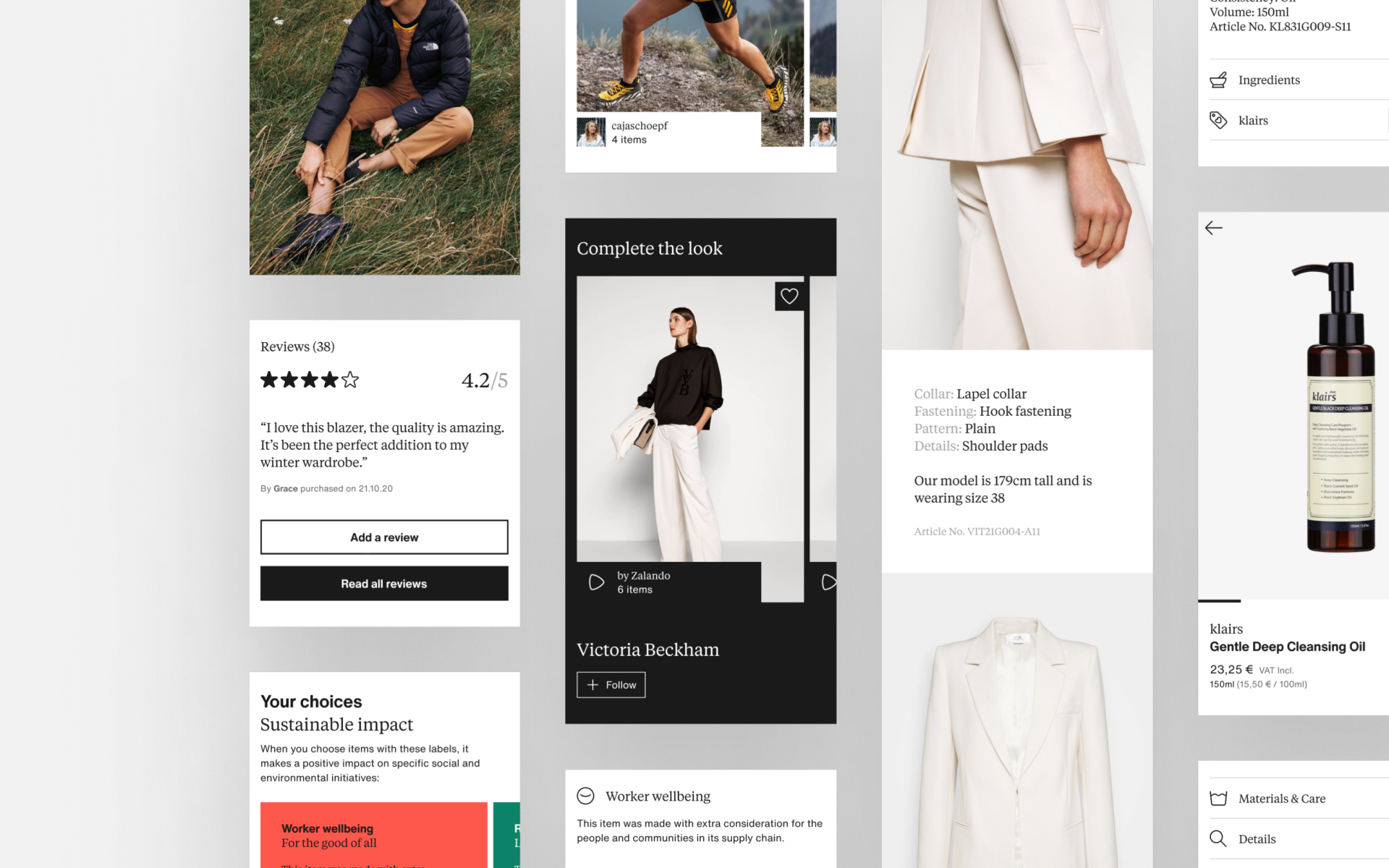
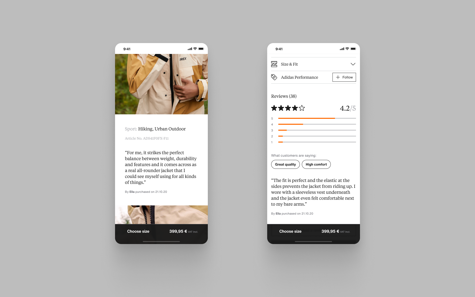
Product details
There were no concerns around customers finding more information about the products. In general, the highlights tiles was seen as useful even though some participants didn’t think the content in the tile was a ‘highlight’.
04.
Next steps
To progress with this project and make it scalable at Zalando, the content quality needs to drive the renders we present to the customers. Category specific research needed to identify what would create product highlights in targeted categories with the content we have available.
Designing for scale
Taking a modular approach
At this point in the project, we have seen the potential from a modular approach, even with limited success in the small user test. From all the work we put into page layouts and compositions, we felt confident to pursue variants of two tiles for a limited A/B test. We identified reviews and product highlights as tiles that would deliver most value without creating the disorientation we feared might harm a complete page level composition and render change.
Tile definition
01.
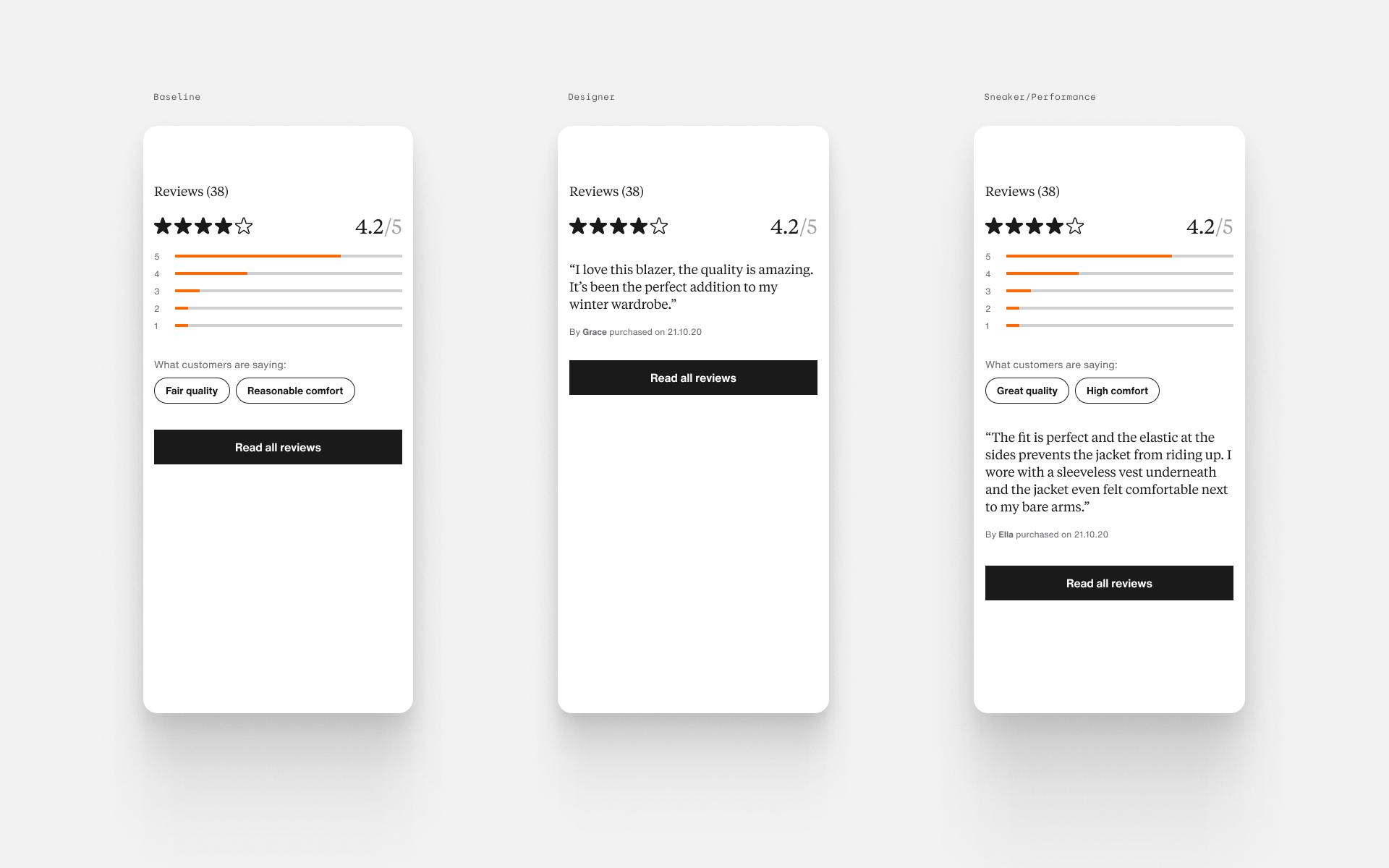
Reviews
Reviews represented a key differentiator between brands, retailers and the different product categories.
02.
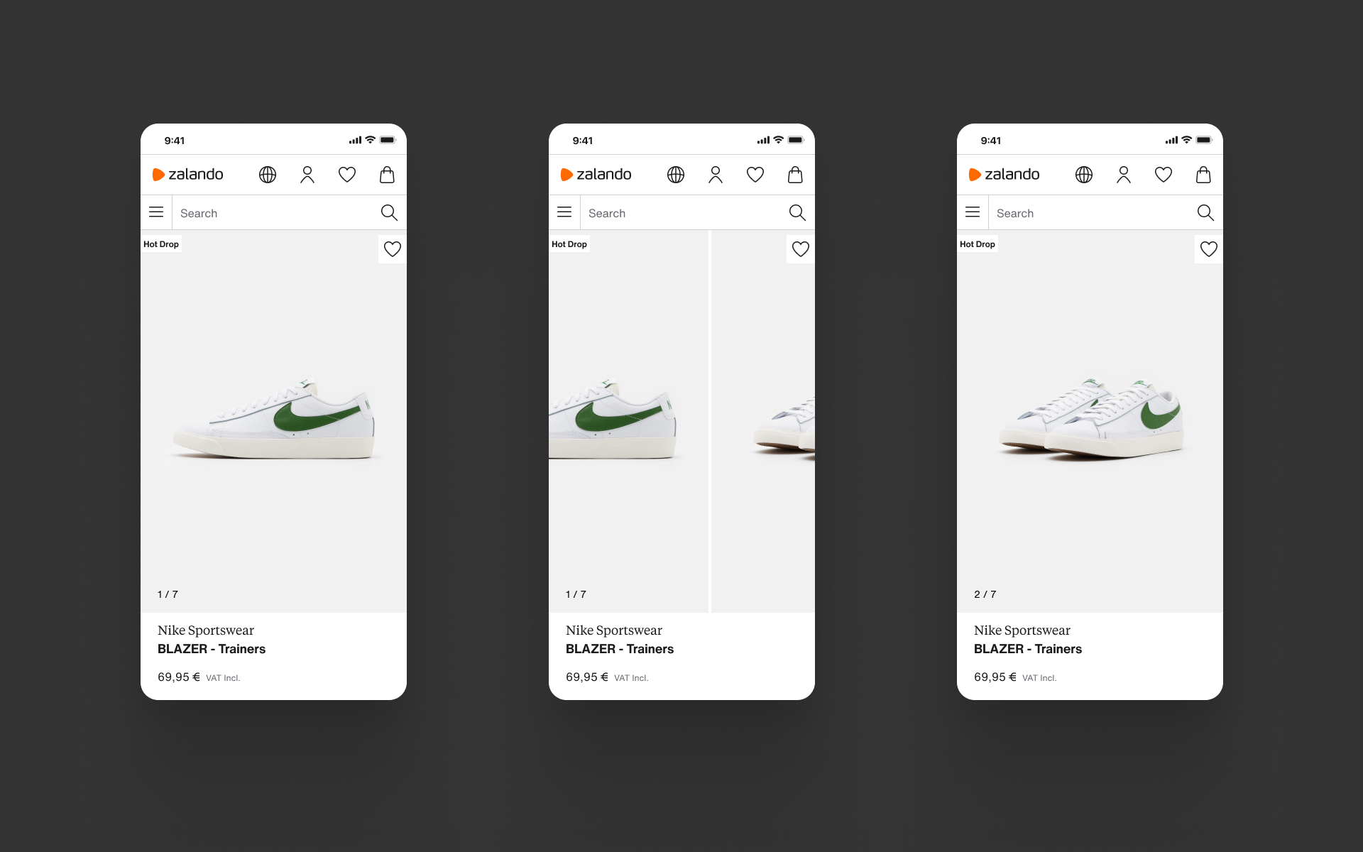
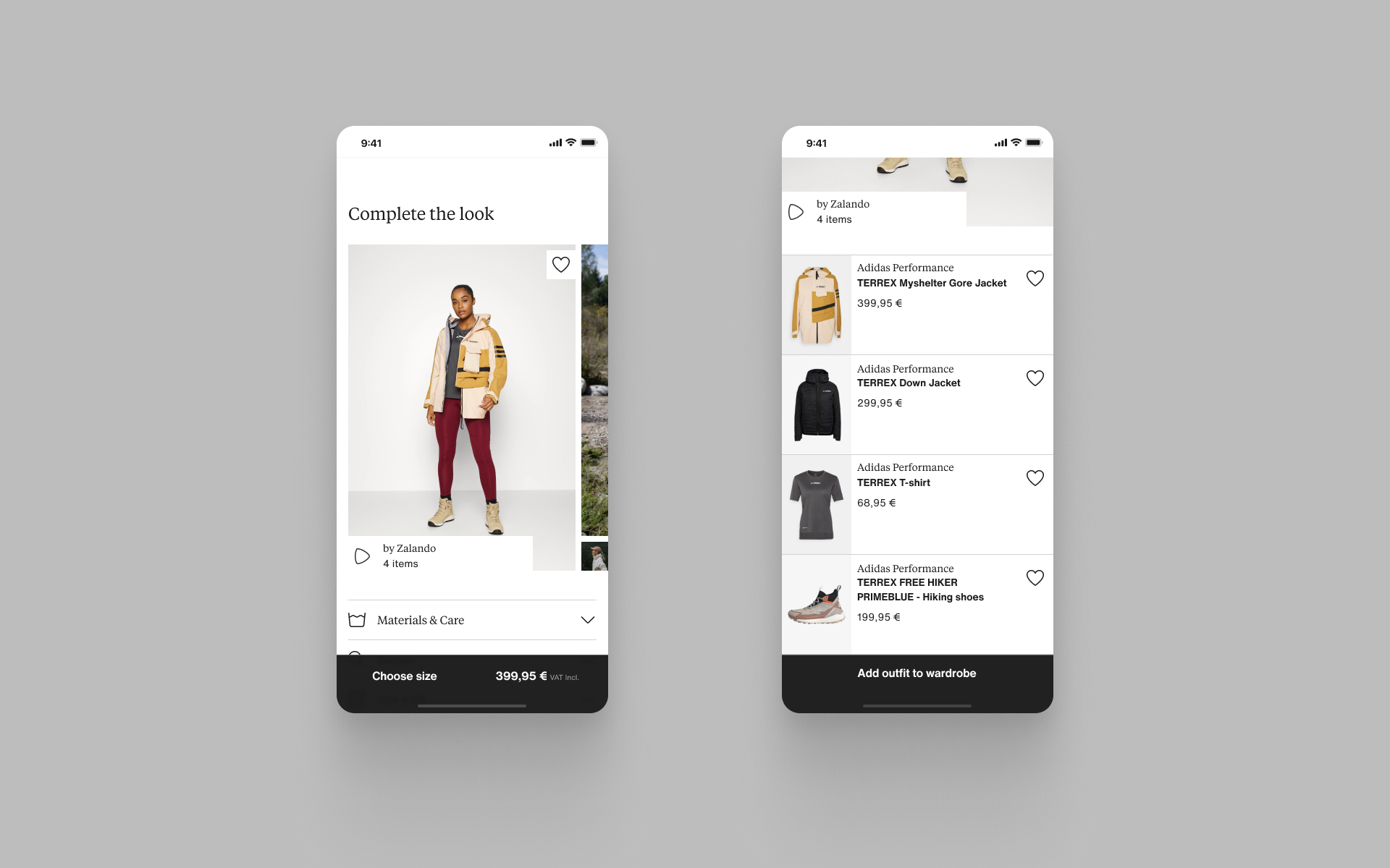
Image gallery
As we learnt from qualitative and quantitative studies, image galleries are the most important tiles for conversion and represent the clearest point of distinction between each value and category.
Conclusions
Unfinished business
As the Weave/Label redesign project was closing in on its first release, this project gave me a chance to push the templates I’d created in that project much further and discover how far Zalando still has to go. Dealing with a high level of ambiguity, I have initiated a solid framework, thinking more strategically to build on and add to Weave, setting the platform to improve product presentation at Zalando.
This was just beginning of the project, we still had a lot of questions about how different values and categories should be treated, how technically feasible these ideas are and where to focus first. We need to understand how customers perceive the changes we hope to make and if the content we provide with our products can be enhanced for even more impact with upcoming concept testing.