March – December 2019
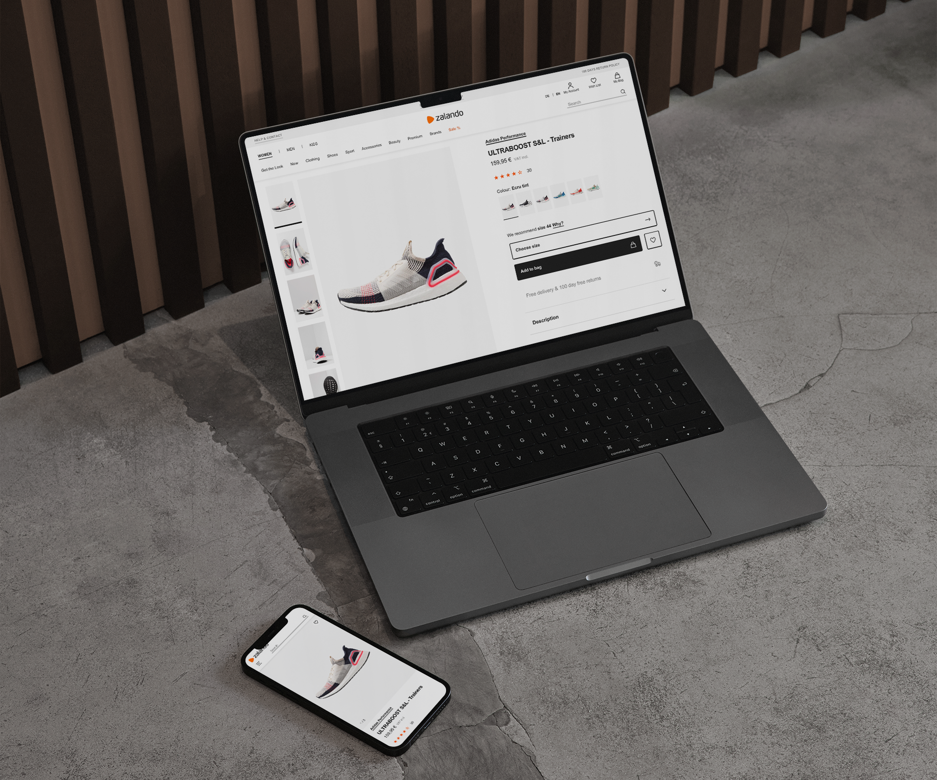
Product Detail Page – Migration
Our team was asked to combine customer focused improvements to the PDP from interviews and concept testing with a migration to a new front-end framework designed to increase collaboration, reduce silos and, improve ease of maintenance. We also needed to find a clear way of measuring the impact of our changes to the customer experience.
Goals & KPIs
01.
AA Accessibility
Achieve AA accessibility rating on the page and across Zalando, screen reading, touch areas, colour contrast.
02.
Design system adoption
Use our Zalando Design System (ZDS) components for visual consistency and easier maintenance.
03.
Merge data sources
Consolidate our data sources for consistent product and business information.
04.
Stable A/B testing
Adopt a measurable release cycle that allows for stable releases and structured iteration.
05.
Incorporate qualitative research
Act on and design for recent user research to add customer experience improvements.
06.
Enable contributions
Allow contributions from other product, design and development teams throughout Zalando.
Before & after
01.
Images are king
Images are the primary source of product information and answers.
02.
Supporting descriptions
Written descriptions and customer reviews play a supporting role.
03.
Reduce conflicts
Conflicts between images and written descriptions cause confusion.
Before & after
High level analysis
01.
Image gallery
Low quality and inconsistent resolution images harmed performance. Gesture control on mobile web was ambiguous and didn’t always work as expected, leading to a high bounce rate.
02.
Inconsistent UI
No two components appear the same, undermining trust in Zalando. The PDP also used type styles, colours, buttons and spacing that was not consistent with our design library.
03.
Hidden details
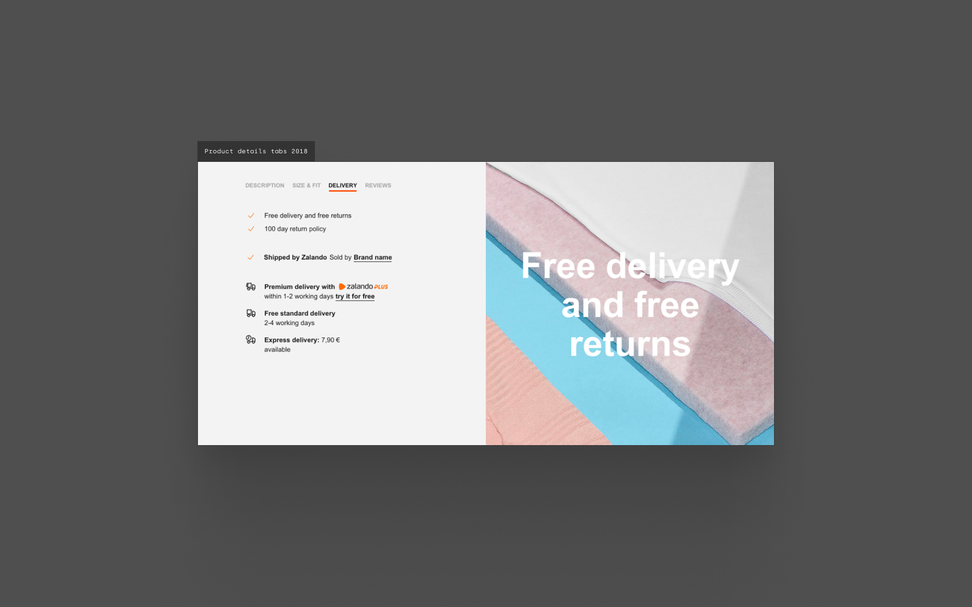
The tabbed product details section meant that customers often missed the information they were looking for. The tile itself was also only partly responsive and behaved differently at smaller sizes.
04.
Low context
Each product image is seen in isolation with little to no written details to confirm the customer’s preconceptions of the product, purchasing in hope rather than expectation as they use images to make their decisions.
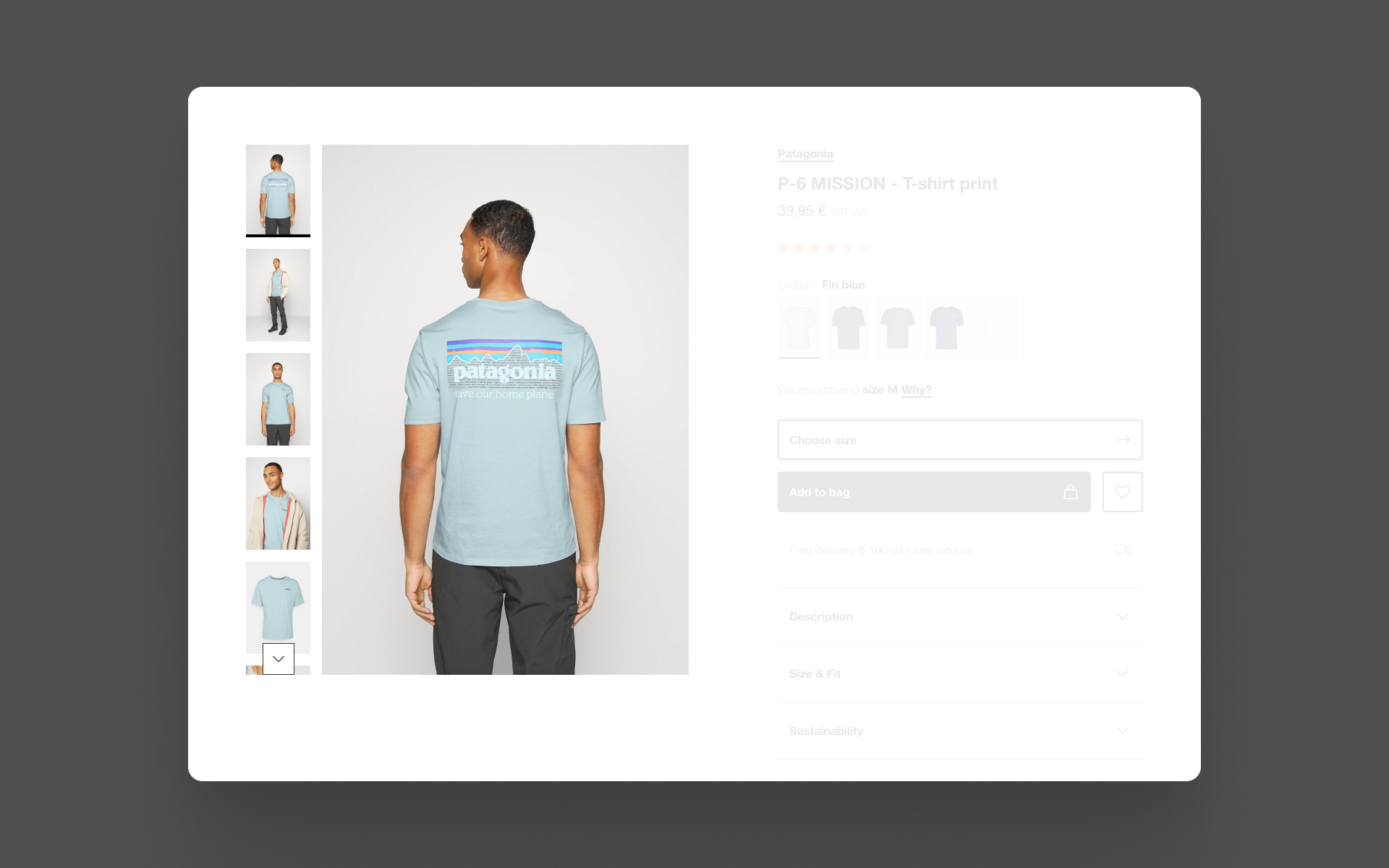
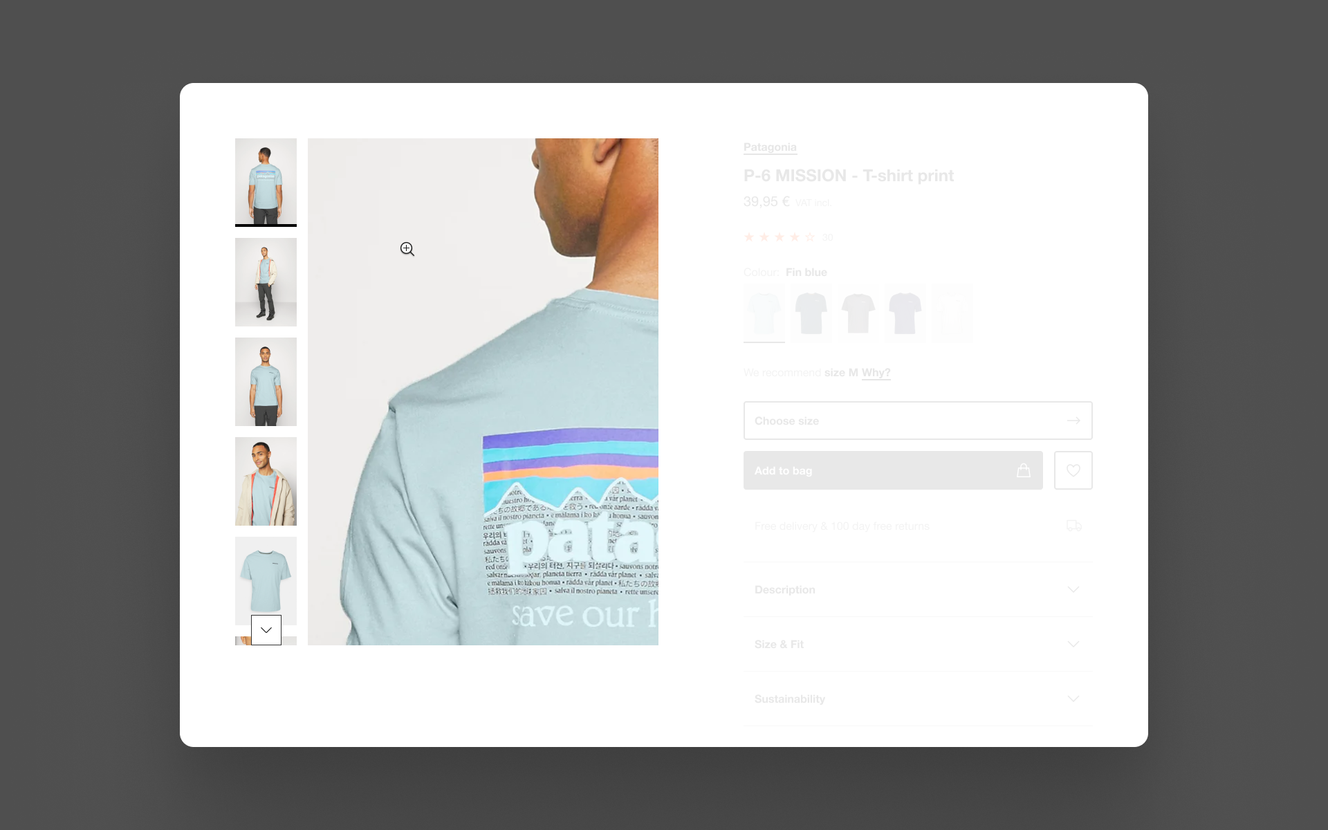
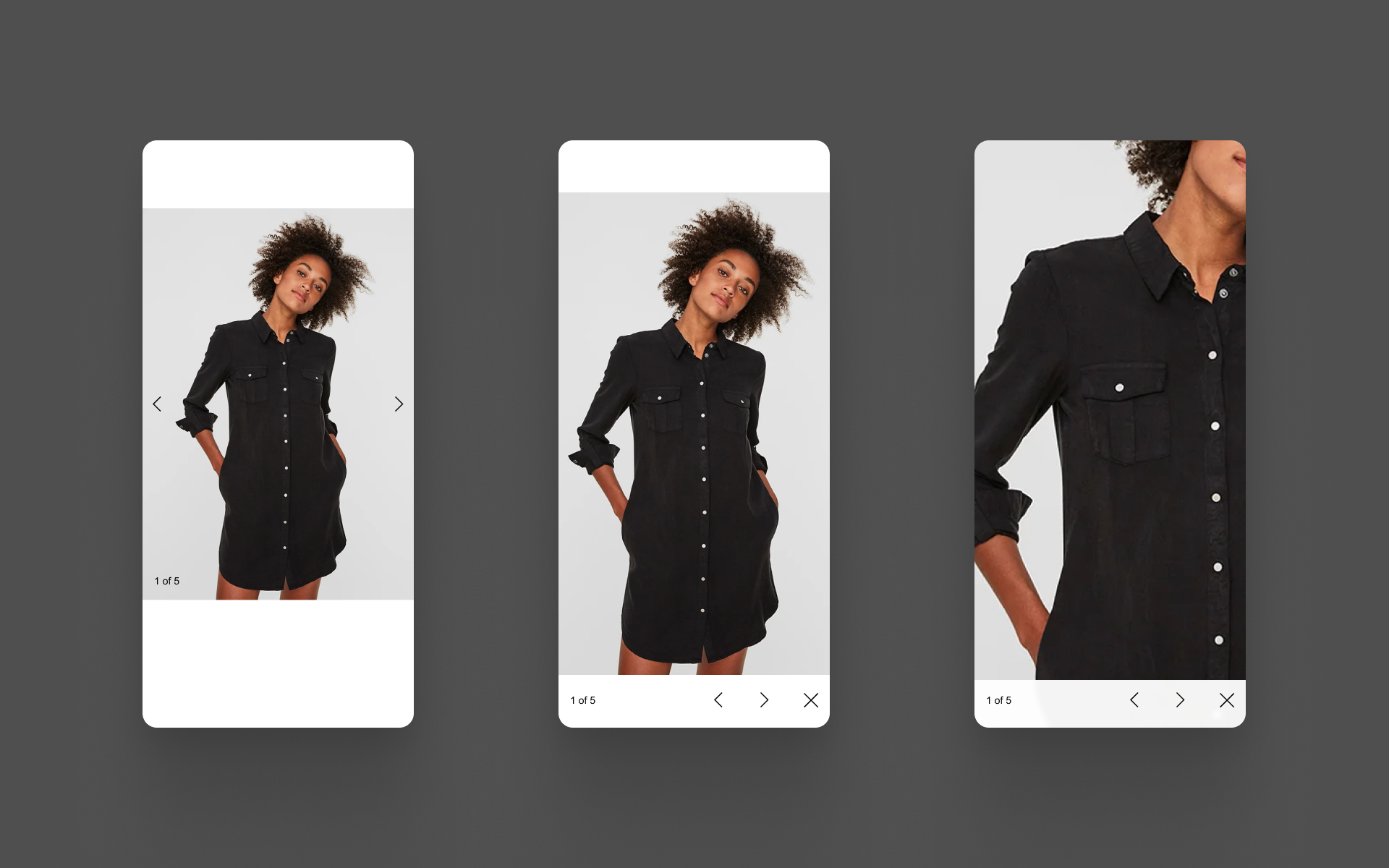
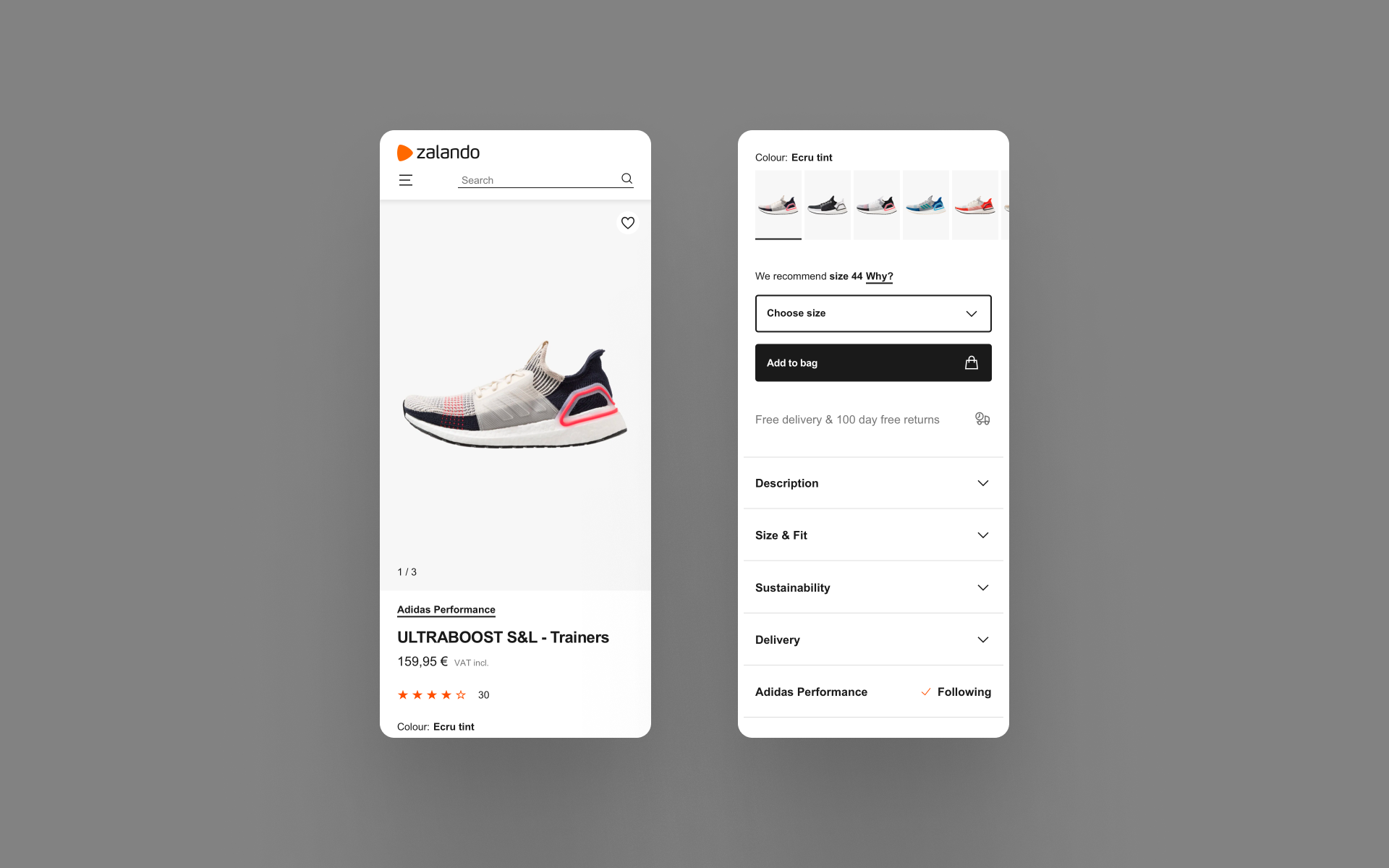
Image gallery updates
We needed to provide a customer with the ability to see a product in as much detail as they need, as easily as possible. This created two work streams; the first was to improve the image resolution without affecting loading speeds, and second, to improve the interaction patterns on both mobile and desktop web.
We improved the resolution of our images whilst reducing file sizes, allowing customers to load pages faster. Higher resolution images allowed us to dictate a standard going forward as well as providing richer zoom views. Improved gesture control on touch input devices also improved performance and matched customer expectations of how they would handle images in native apps.
Measuring success
+1.05%
Revenue per user from improved gallery layout.
+1.69%
Revenue per user from increased image resolution.
+2.40%
Revenue per user from improved gesture control.
We confirmed that any improvements to the image gallery would have significant positive impact on revenue via conversion. We learned how to successfully design and deploy new components on a legacy framework, still gain valuable insight and contribute a new tile to our design system.
We now had a method to deploy components and isolate them to see what this change would have on the performance and experience from quantitative data.
Updates
01.
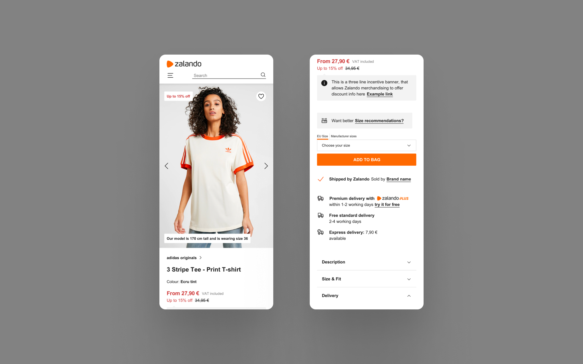
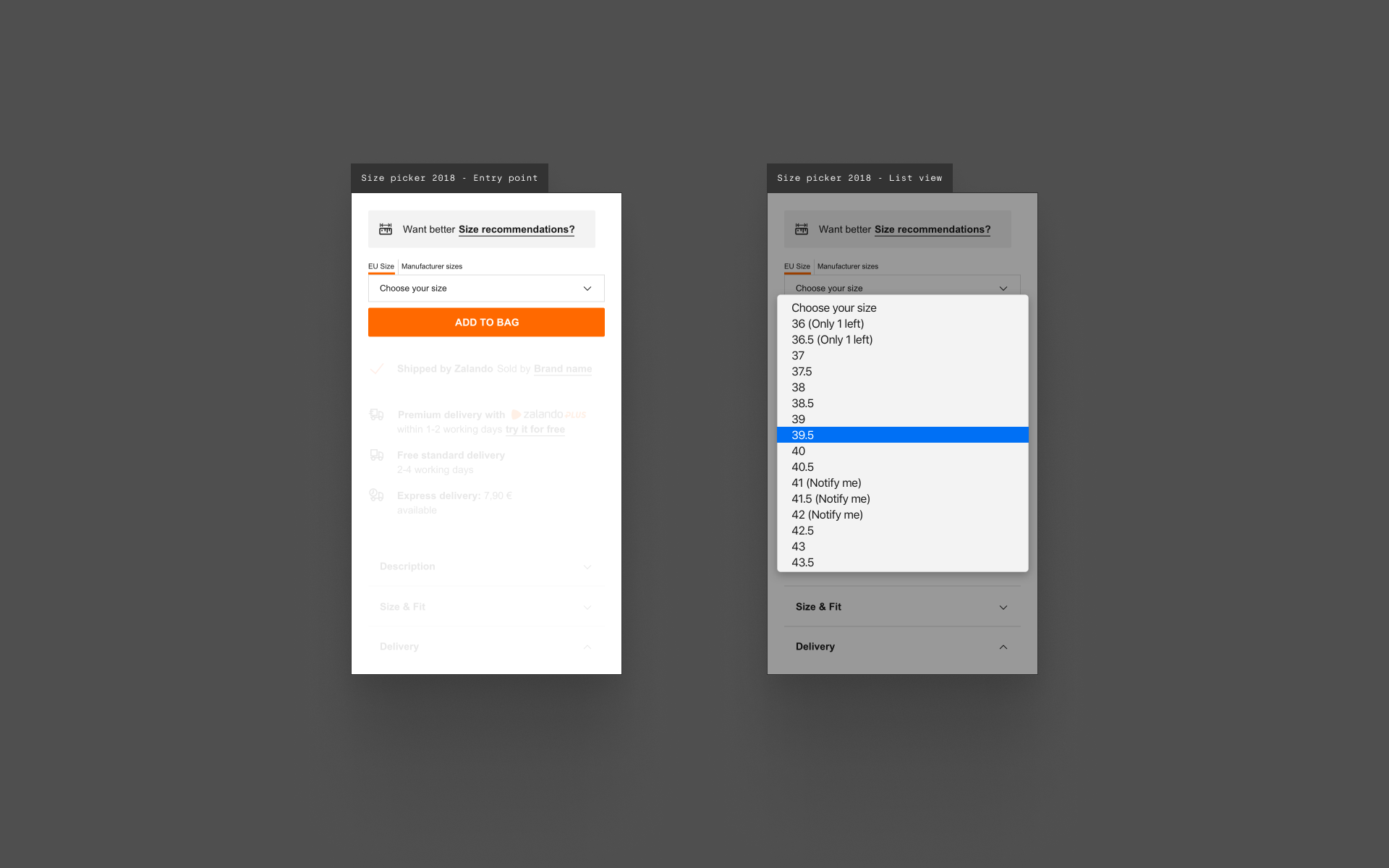
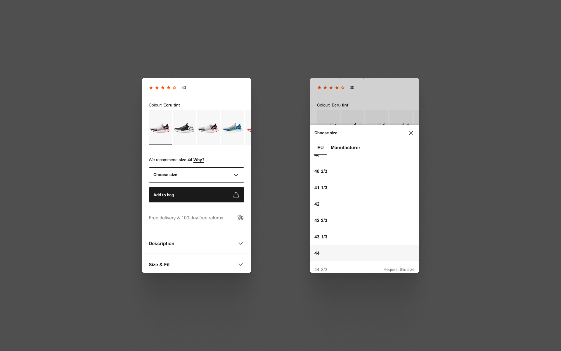
Universal size picker
On mobile web, we would not be able to deliver consistent information in the size picker. Depending on the device the customer was using, they would see different size specific information. For example, at the time on Android we could not show the “notify me” text or low stock notification as it did not fit into the native dropdown selection component.
Our solution was to build a custom size selection component that we would be able to modify and maintain ourselves regardless of device or operating system. This allowed us a lot more flexibility and freedom to add more relevant information when the customer needed it, potentially reducing the burden placed on the main UI of the PDP.
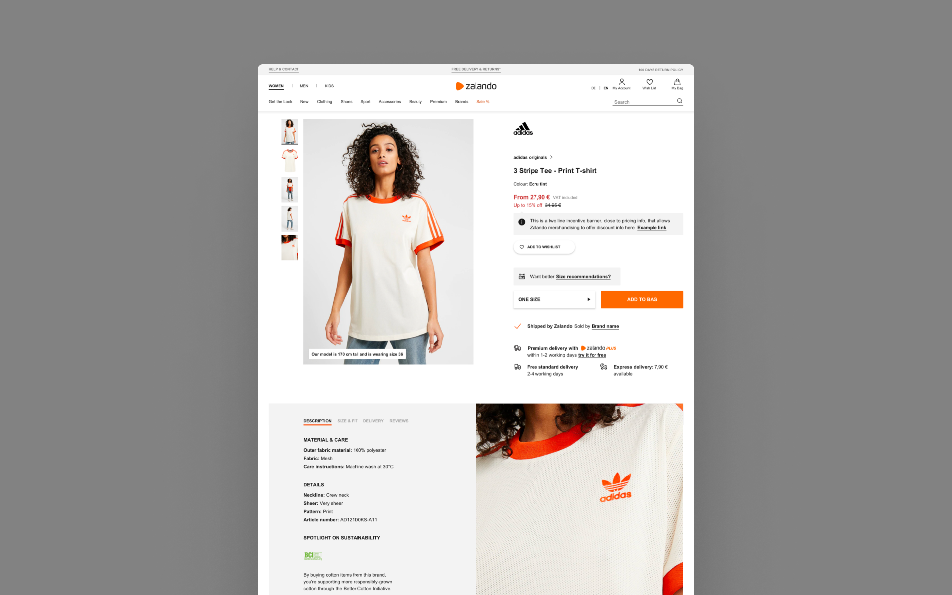
02.
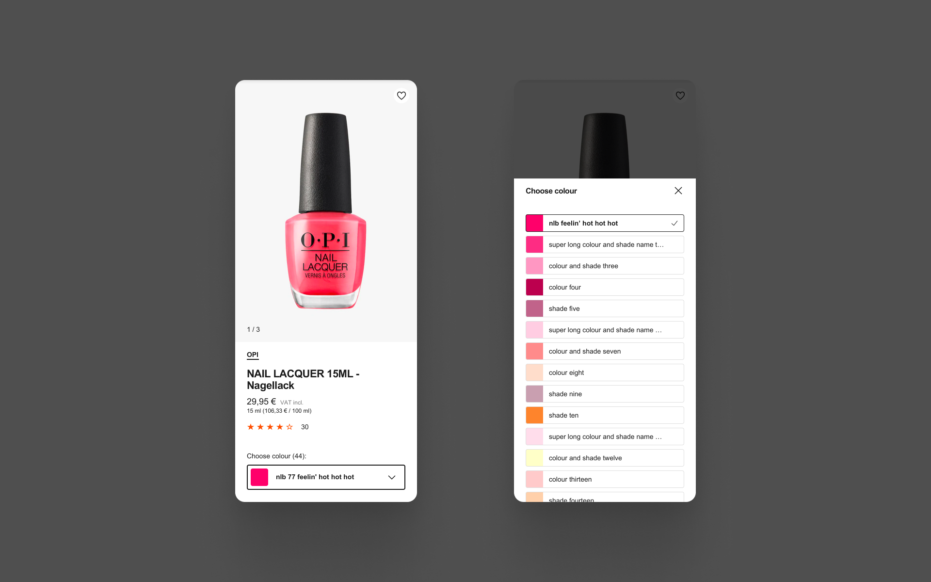
Beauty colour picker
The previous colour picker in the context of beauty used swatches to show the options available, with no names to distinguish different shades if the customer knew what they were already looking for. It provided a frustrating experience as they had to guess which swatches they had already looked at. The new colour picker allowed customers to see all the colours with their names for easier use with a larger area for gesture control on mobile.
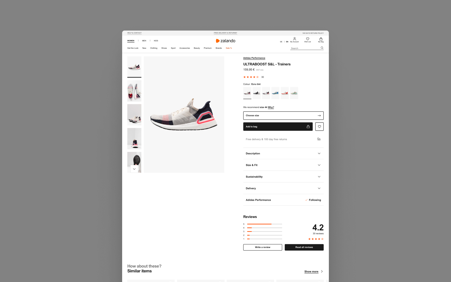
03.
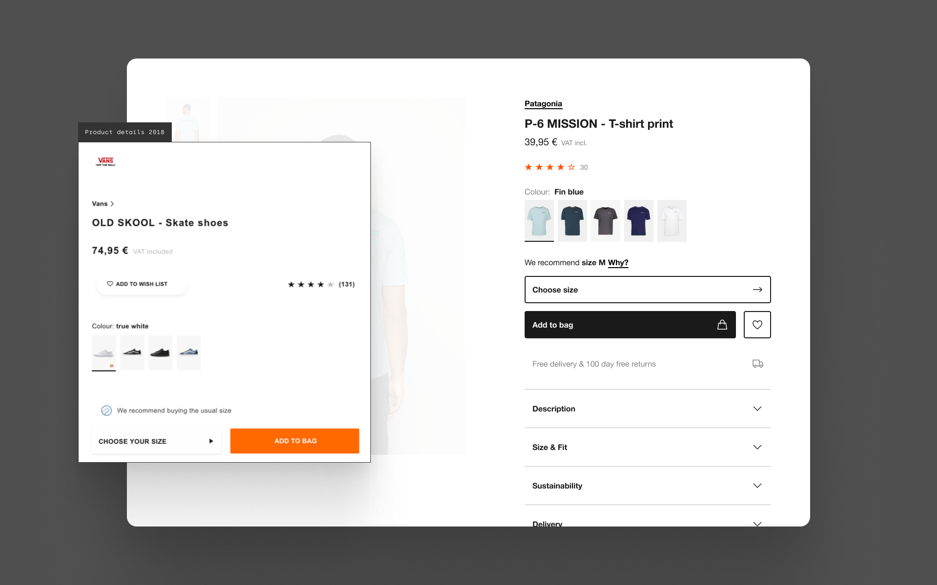
Product details accordions
User testing had confirmed our assumptions that product details were hard to find with the tabbed details tile (image right) with customers assuming that the information they were looking for didn’t exist on Zalando. This meant that they would look elsewhere for this information and potentially purchase somewhere else as well.
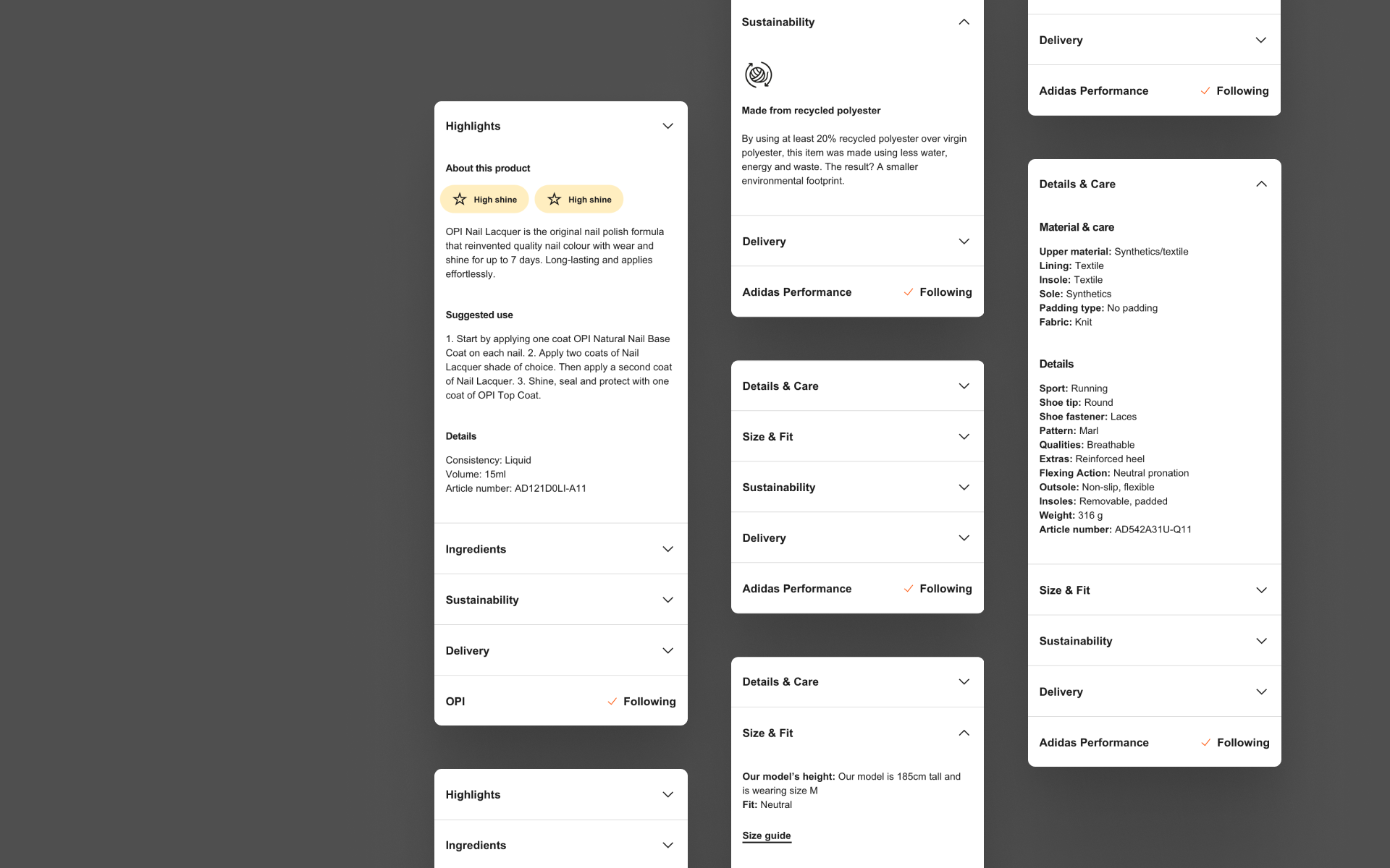
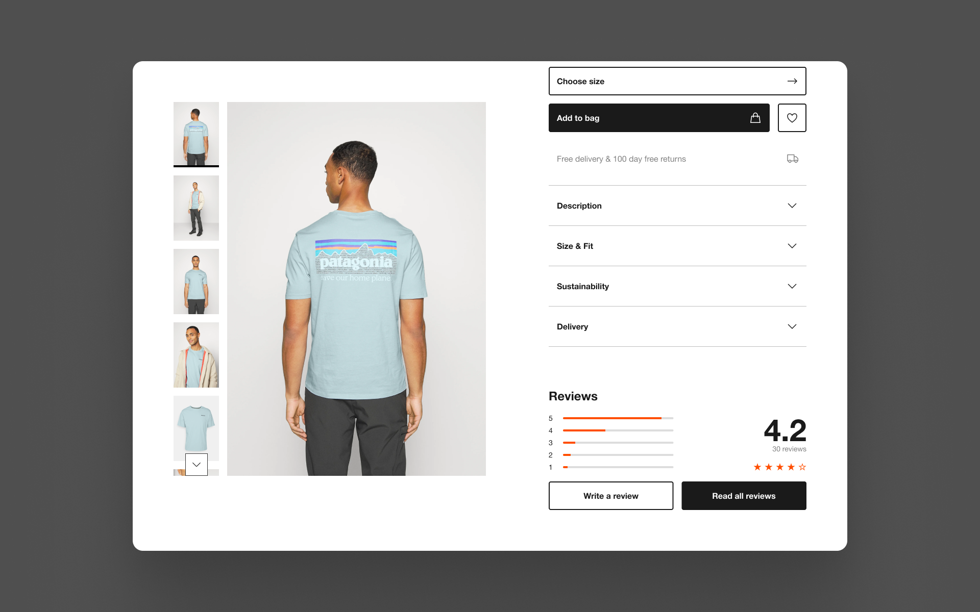
We adopted an accordion pattern for product details to show where the key product headers would be, making it easier for customers to scan for information they are looking for from the title of each section. We could also call out other sections more clearly like reviews, placing customer created content next to the raw product details to provide a more balanced overview of the product. From a technical point of view, the accordions were far more flexible for content, allowing us to add richer content and not be constrained by a predefined height.
04.
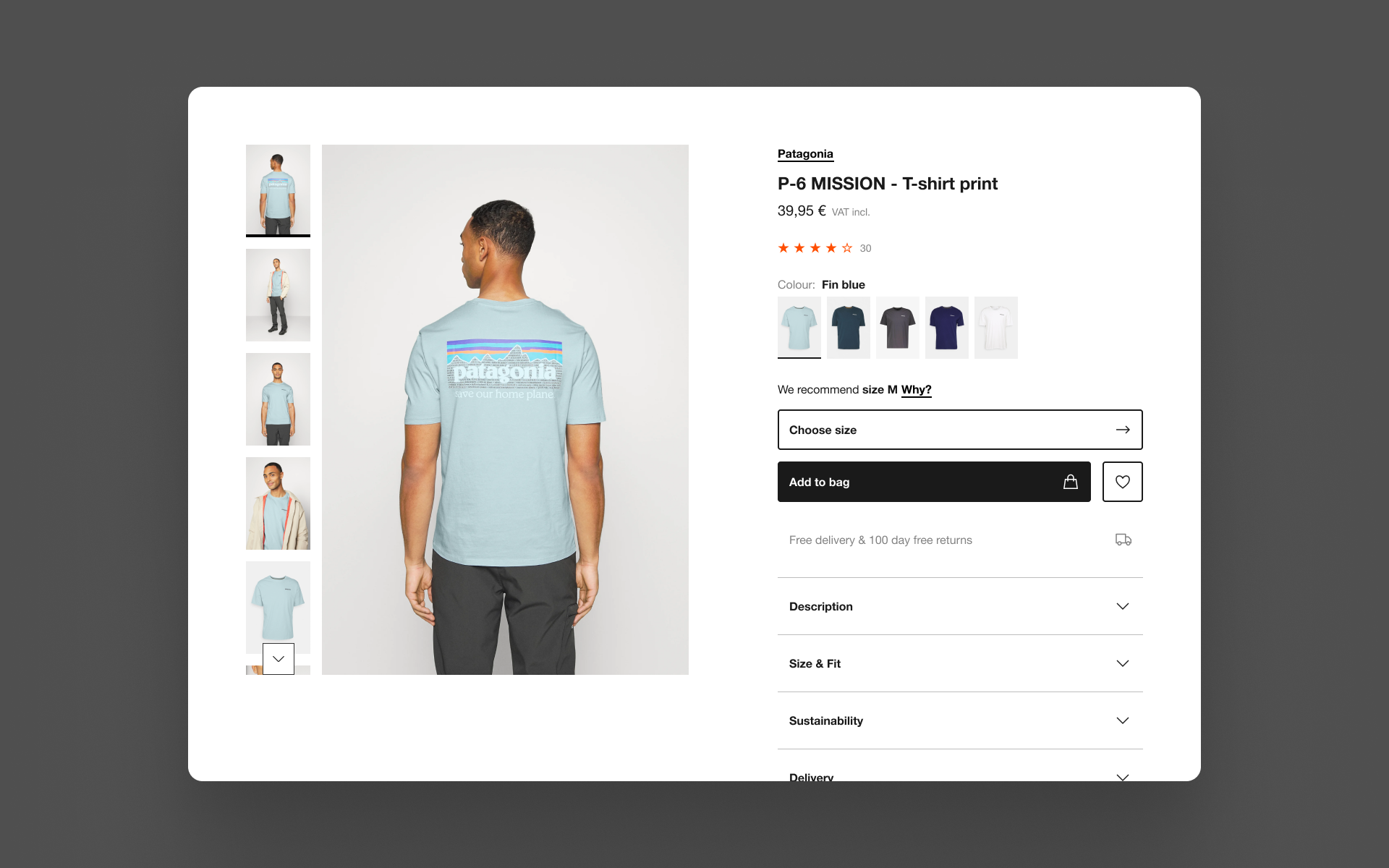
Sticky image gallery
Moving the product details into accordions made more space available on desktop and larger devices with our split view PDP. We took this opportunity to add more context to the product details with a ‘sticky’ image gallery that follows the customer as they scroll, allowing them to read information from the tabs and assess the product images at the same time.
Learnings
An exercise in rationalisation and reducing complexity, this project gave me the opportunity to fully assess the how we could present product more effectively. We were able to improve performance, increase revenue significantly through image gallery upgrades and deliver a AA accessible PDP in six months. This project would not have been possible without the support and collaboration of so many teams, this was the first step to a more adaptable and modular PDP.