June 2019 – May 2020
Product Detail Page – Project Weave; Brand Redesign
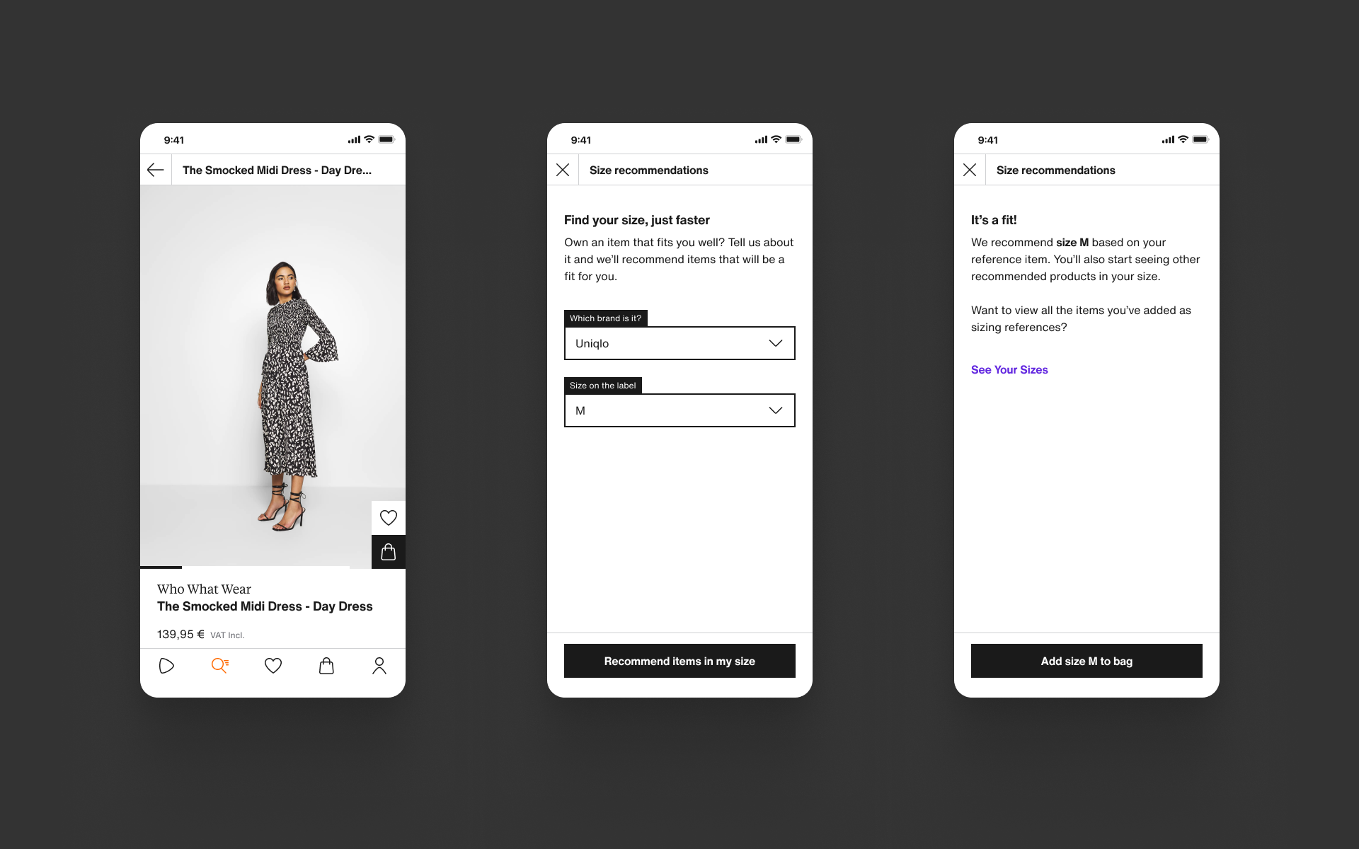
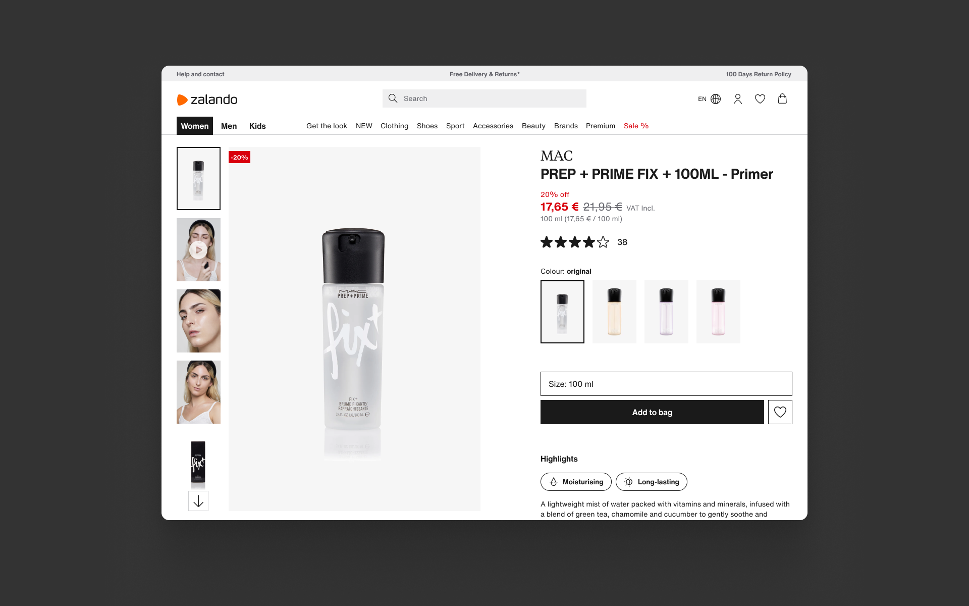
Project Weave is a redesign project aiming to create a more distinct and memorable experience for our customers whilst introducing new features for our customers like Wardrobe and Pre-owned. I worked with our central design team to redesign our PDP and product cards in the new visual language.
Context; scope
Zalando’s native app experiences needed visual and experience upgrades to address common usability complaints via app stores, NPS feedback and user testing. We wanted to bring over some of the key learnings from the migration project to improve the user experience and bring our platforms closer together. Our goal was to simplify the core app experience and while making it easier for product teams to maintain and release updates.
Before this project, app and web experiences were managed by different product teams with different features and user experiences. Combining the product detail page scope into one product team gave us the opportunity to unify the customer experience and create a more transparent working practise.
I worked on bringing the Label concept to life on the product detail page across iOS, Android and Web. Collaborating with web, iOS and Android development teams, and with multiple product teams. I also worked closely with the central design teams (The Studio & ZDS) to apply the visual ‘Label’ concept appropriately and contribute components, tiles and patterns back to the new library being built simultaneously.
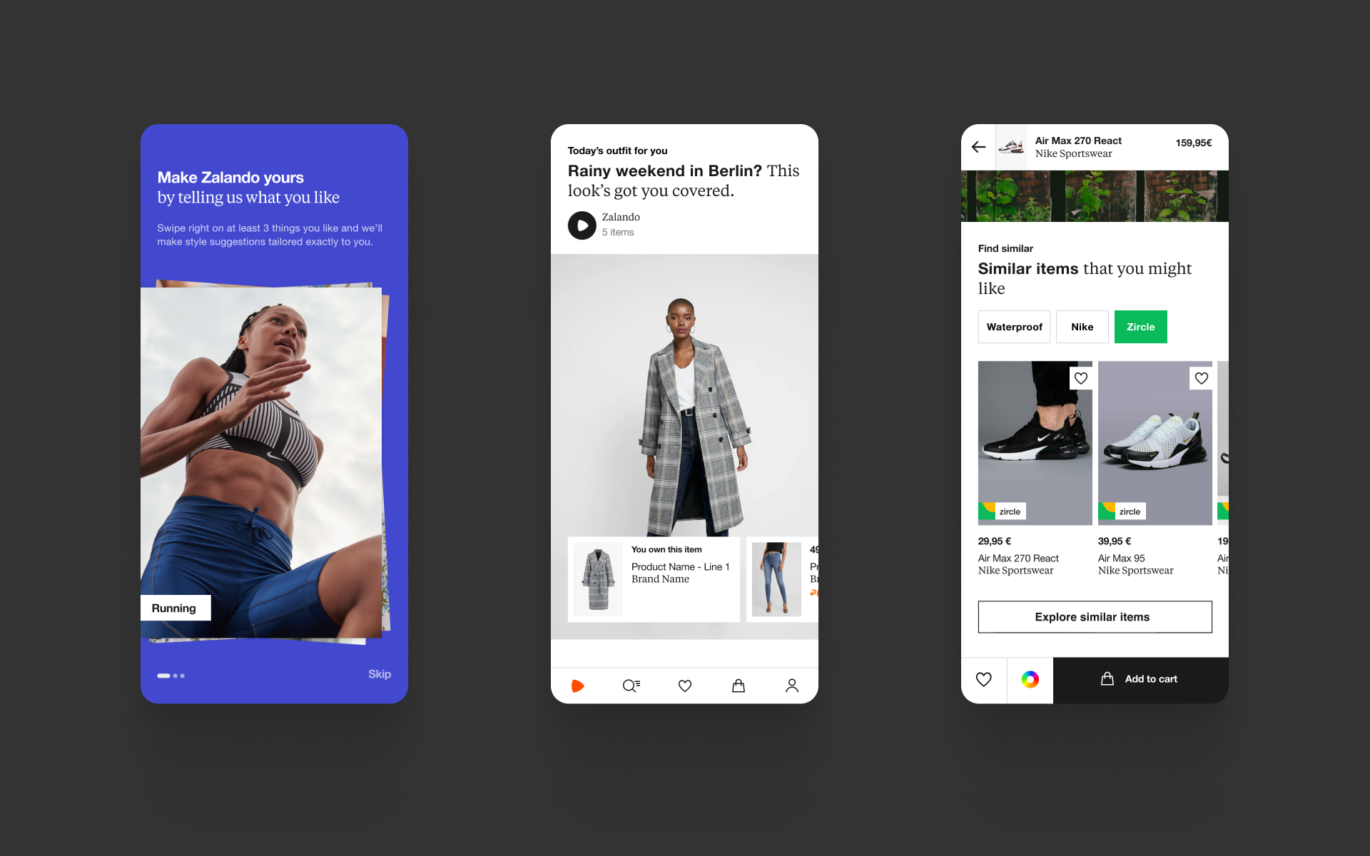
Concept design direction from the in-house concept team, "The Studio" closely linked to the Zalando Design System team (ZDS)
Context; the Label
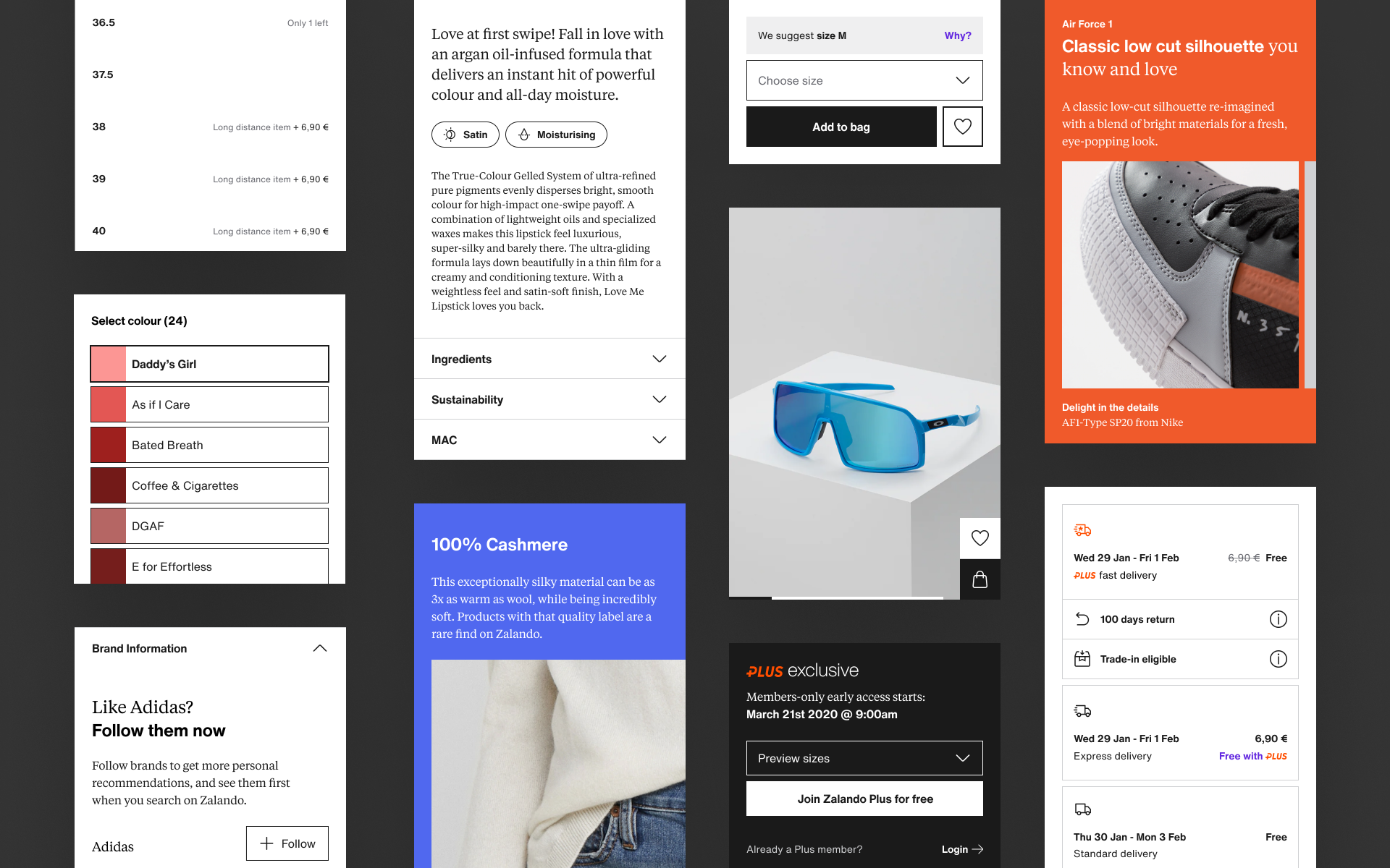
Zalando’s central design team (The Studio) used the metaphor of a clothing care label to provide a relatable aesthetic that could be applied to all platforms and ‘weave’ the experience together. This visual style as a metaphor was branded and “The Label”. Images bleeding off the page, more deliberate outlines, bolder typography and colour use made a clear break from the more anaemic past that had no discernible style.
The image above is taken from the concept design direction from the in-house concept team, "The Studio" closely linked to the Zalando Design System team (ZDS). We worked with this art direction and adapted "The Label" metaphor to our functional pages across the customer journey. We regularly shared work in progress and developed a consistent style that could create a coherent customer experience across app and web.
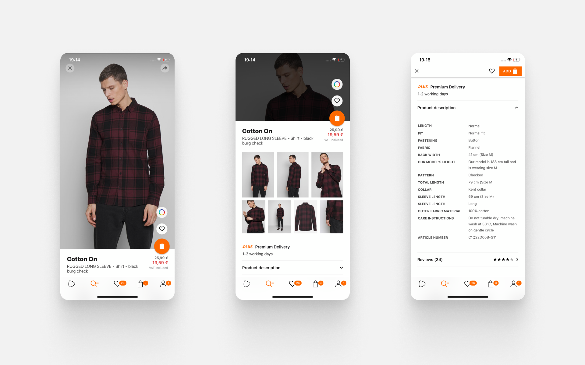
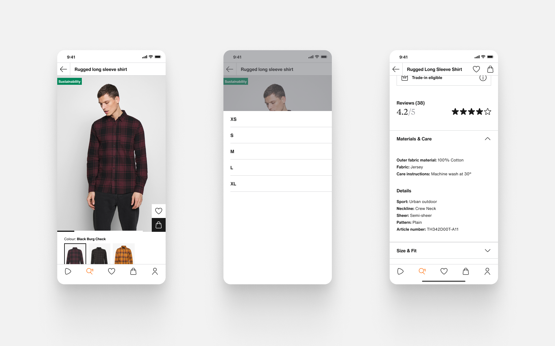
Before & after
High level analysis – app
01.
Cluttered interface
Users struggled with the add to bag button being the only way to access the size picker. The colour picker entry point was frequently missed. Typographic hierarchy and pricing information are also forced into too small a space.
02.
In-page image gallery
Swiping left or right (as if to move between images) moved you to a new product page, this functionality was often cited by customers as frustrating. The thumbnail gallery isn’t close enough to the main gallery to suggest this is the primary control for product images.
03.
Mixed product details
The product information being shown about our products is the same as it is on web but it isn’t displayed in the same way, all details are shown at once making scanning for a particular piece of information quite difficult.
Feature priorities – app
01.
Lead with images
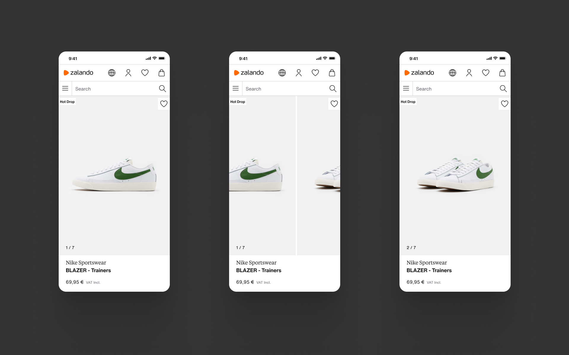
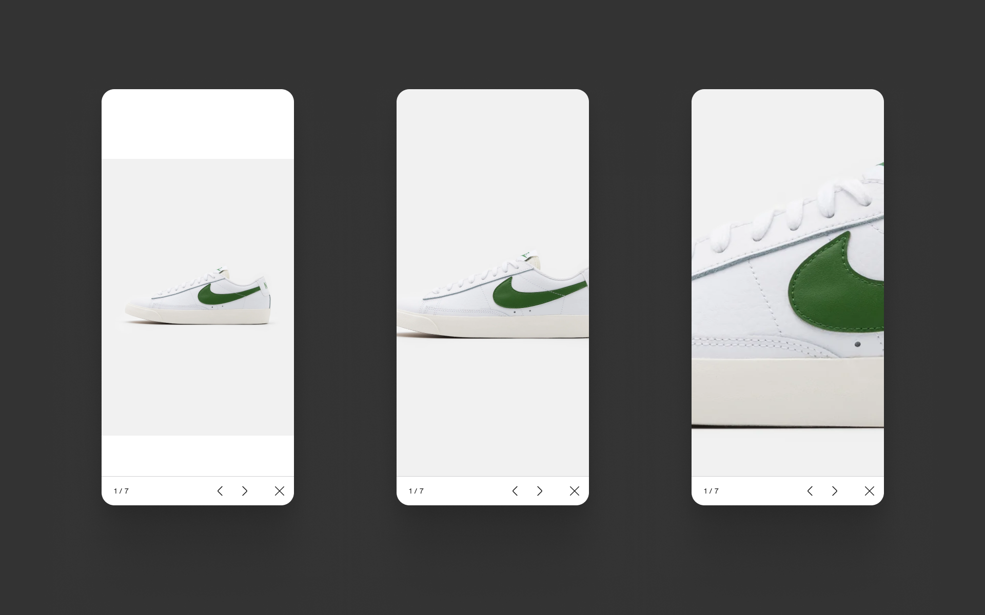
The old app scaled and cropped images to fit them into the viewport, resulting in partly obscured images. Our new design relies on the whole image being available for users to interact with before moving onto the written details below.
02.
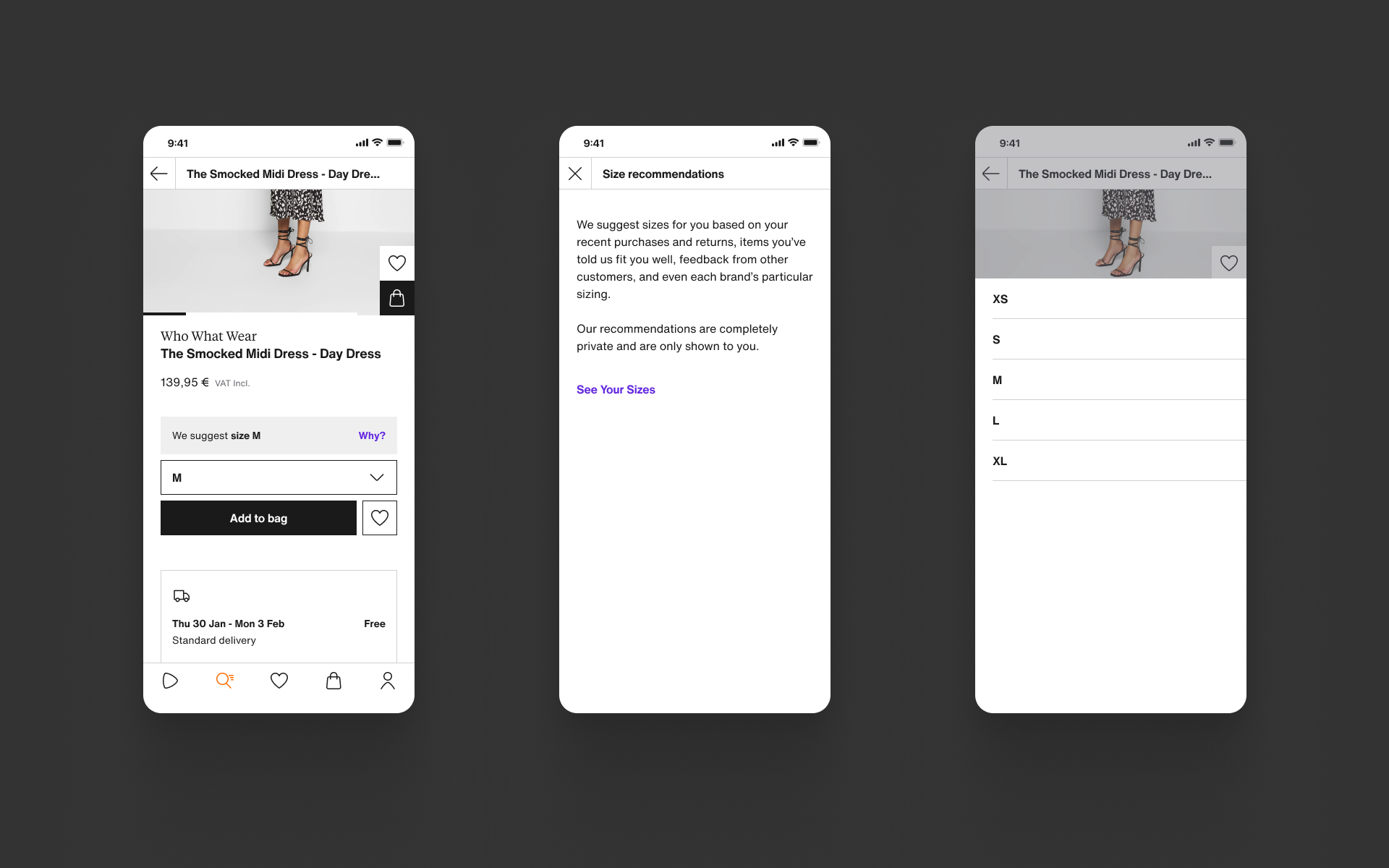
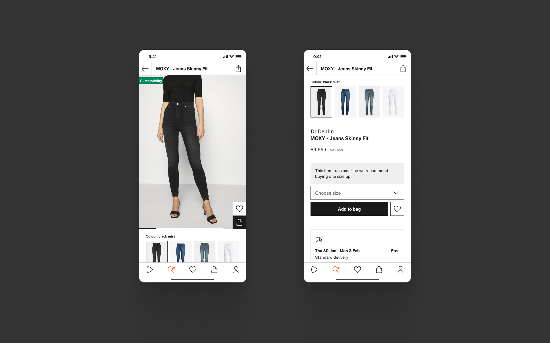
In-page size & colour selection
Hiding the size picker behind the add to bag button meant that customers would not know whether a product was in stock unless they committed to ‘buying’ the item.
03.
Clearer product information
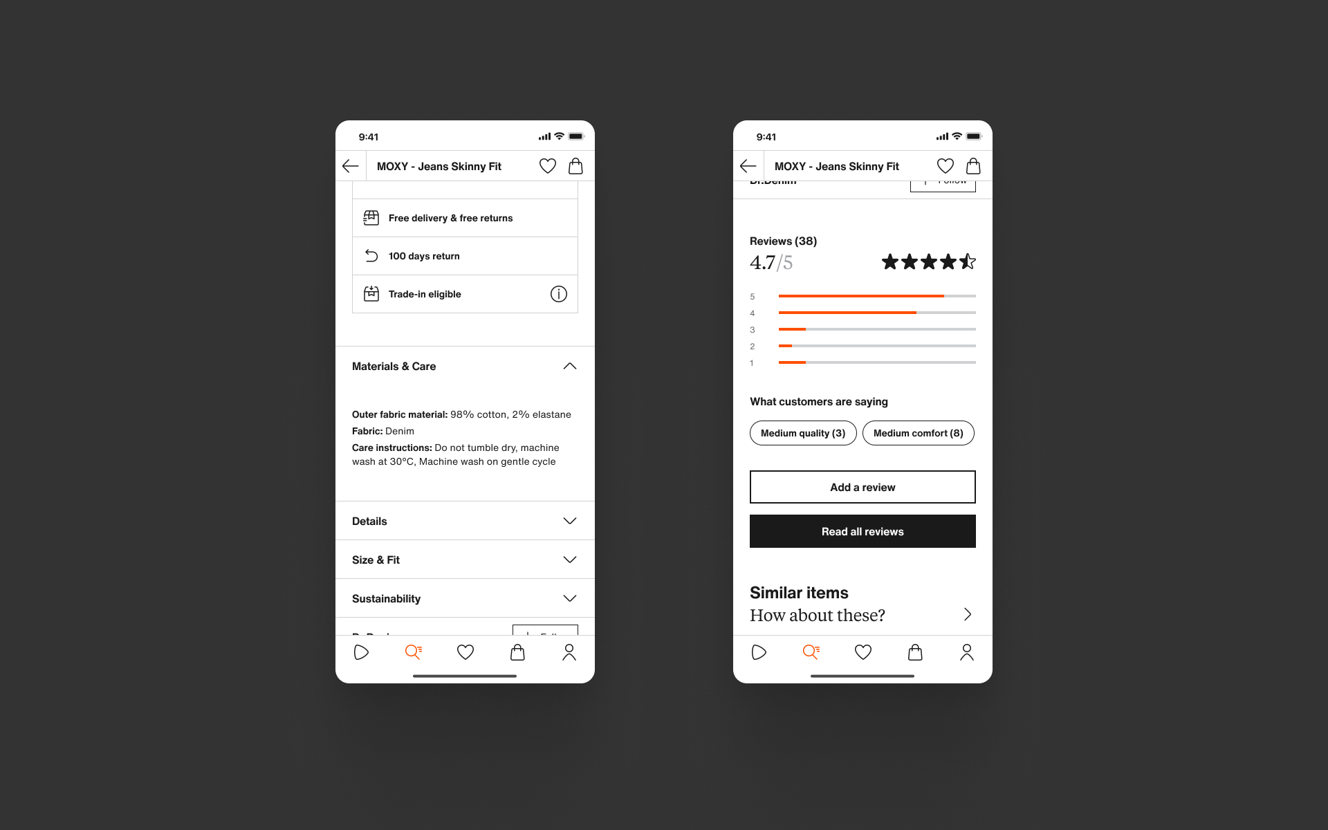
We needed to make it easy for customers to scan the page to find relevant chunks of information. We followed our web UI accordion pattern with clearer titles, lowering the cognitive effort to find information whilst creating experience and information parity.
App & mobile web
Building on what we learned from the PDP migration project, we chose to use the foundational experience from the mobile web experience to our app redesign. While we could be diluting some native interaction patterns, the customer experience needed to prioritise product presentation to hit our KPIs of add to bag rate. The PDP migration project illustrated how to improve the experience on mobile web effectively and we were confident we could repeat this for the app experience.
83%
of PDP users are using a mobile device (app or mobile web)
73%
of users interacted with the image gallery (excl. iOS data)
16%
of users viewed a descriptions (excluding apps)
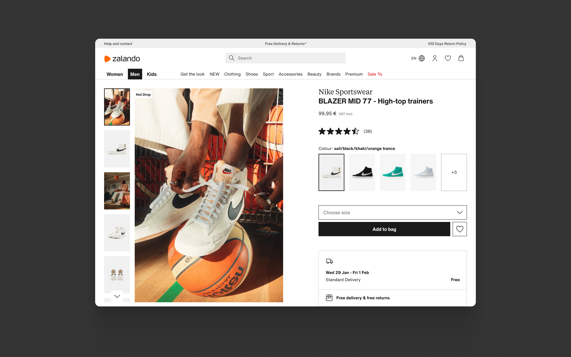
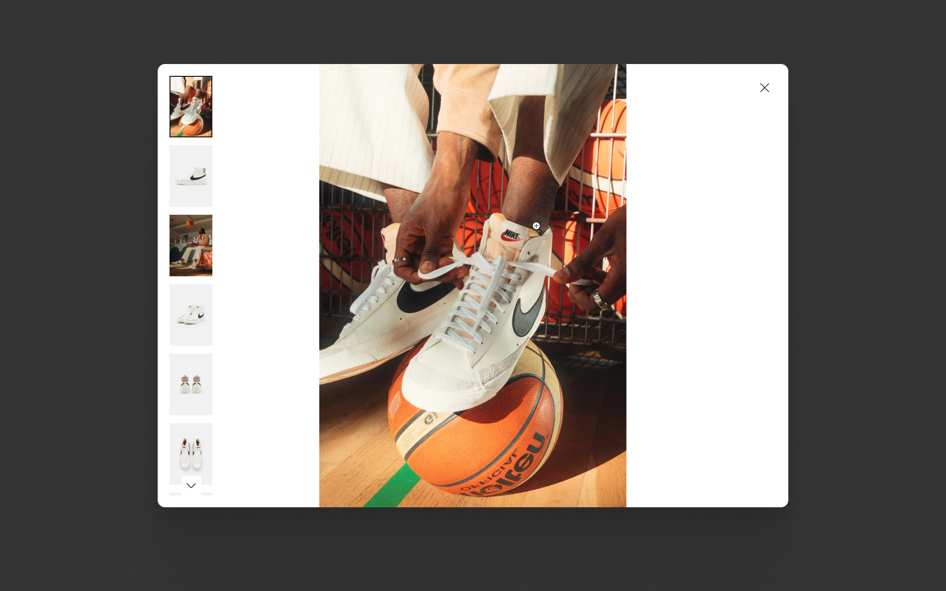
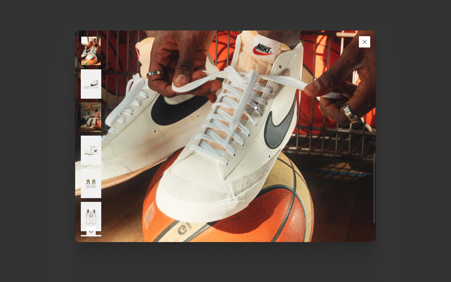
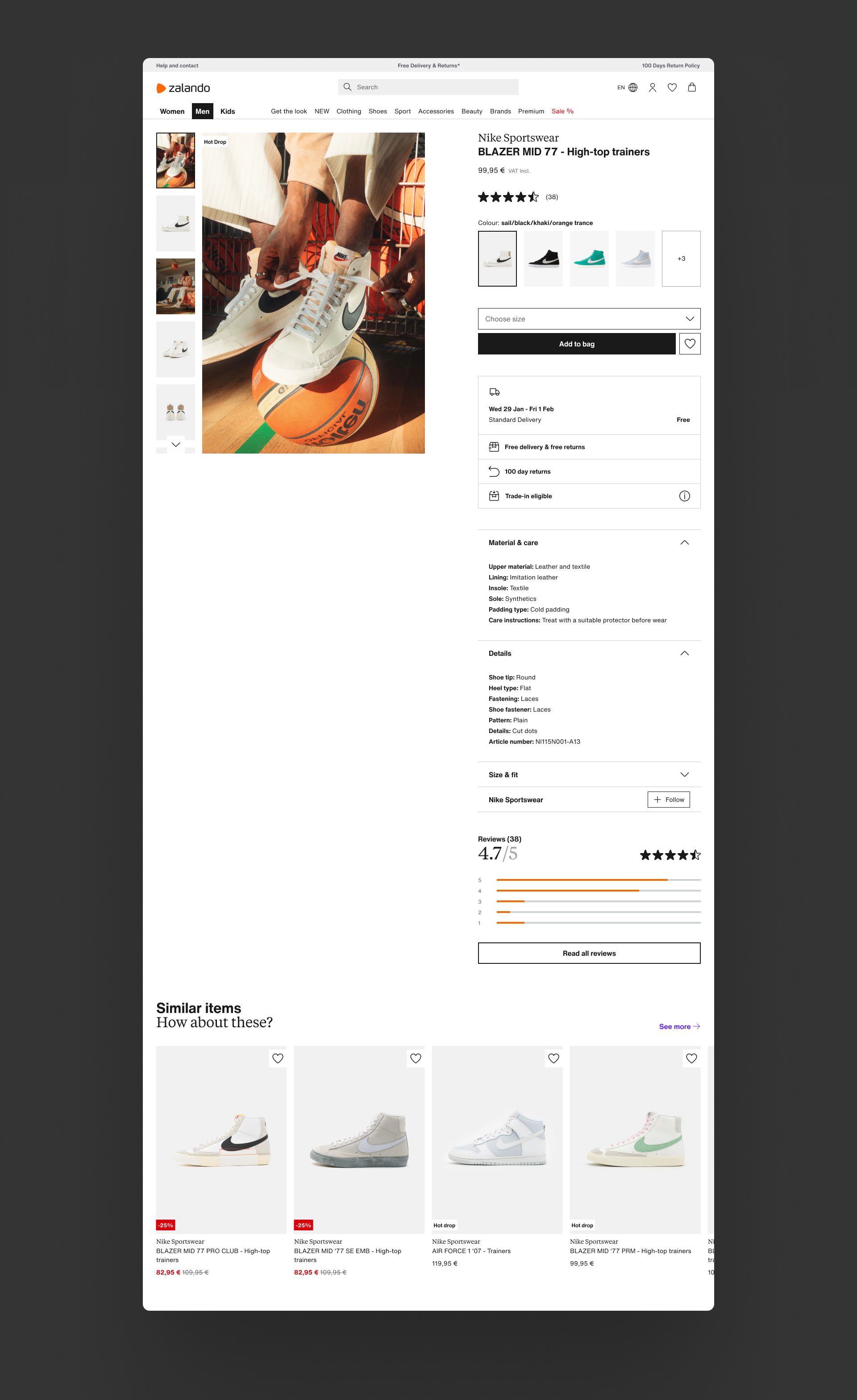
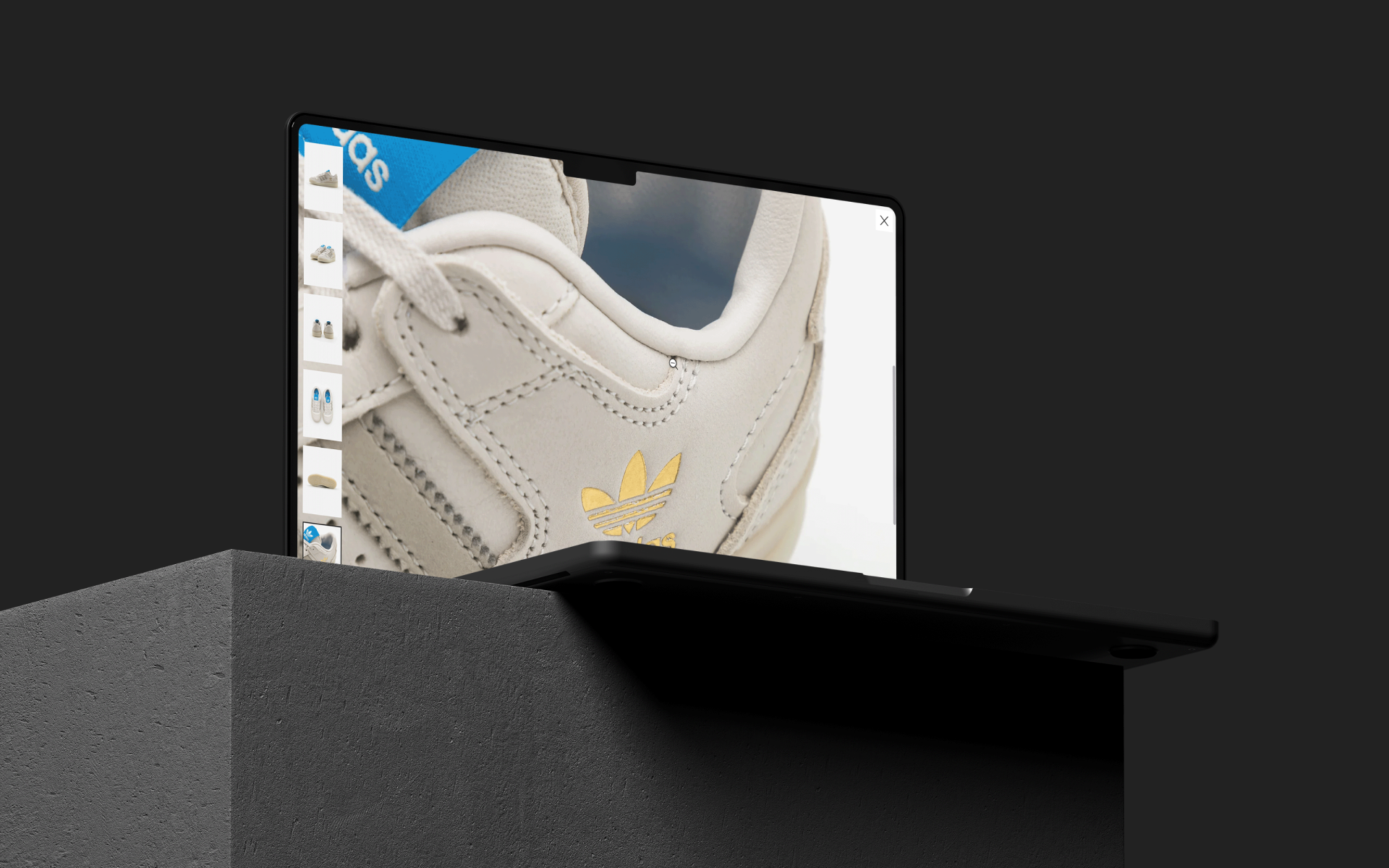
While mobile traffic overtook desktop traffic around 2018, we still needed to make sure the desktop experience presented products as well as possible. We updated image galleries and product details to show off all product details as clearly as possible, allowing the products to stand out from the interface and maximising exposure to images, our biggest driver for conversion.
After completing a heuristic analysis of the old app (first image) and reviewing previous user tests, I began to replace unpopular and frustrating functionality with more functional and scalable features.
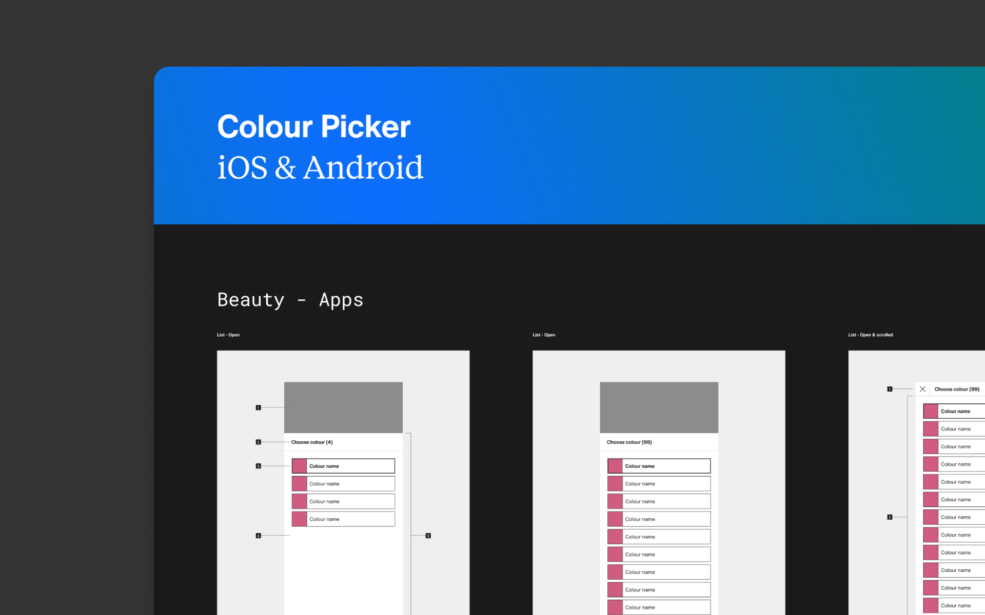
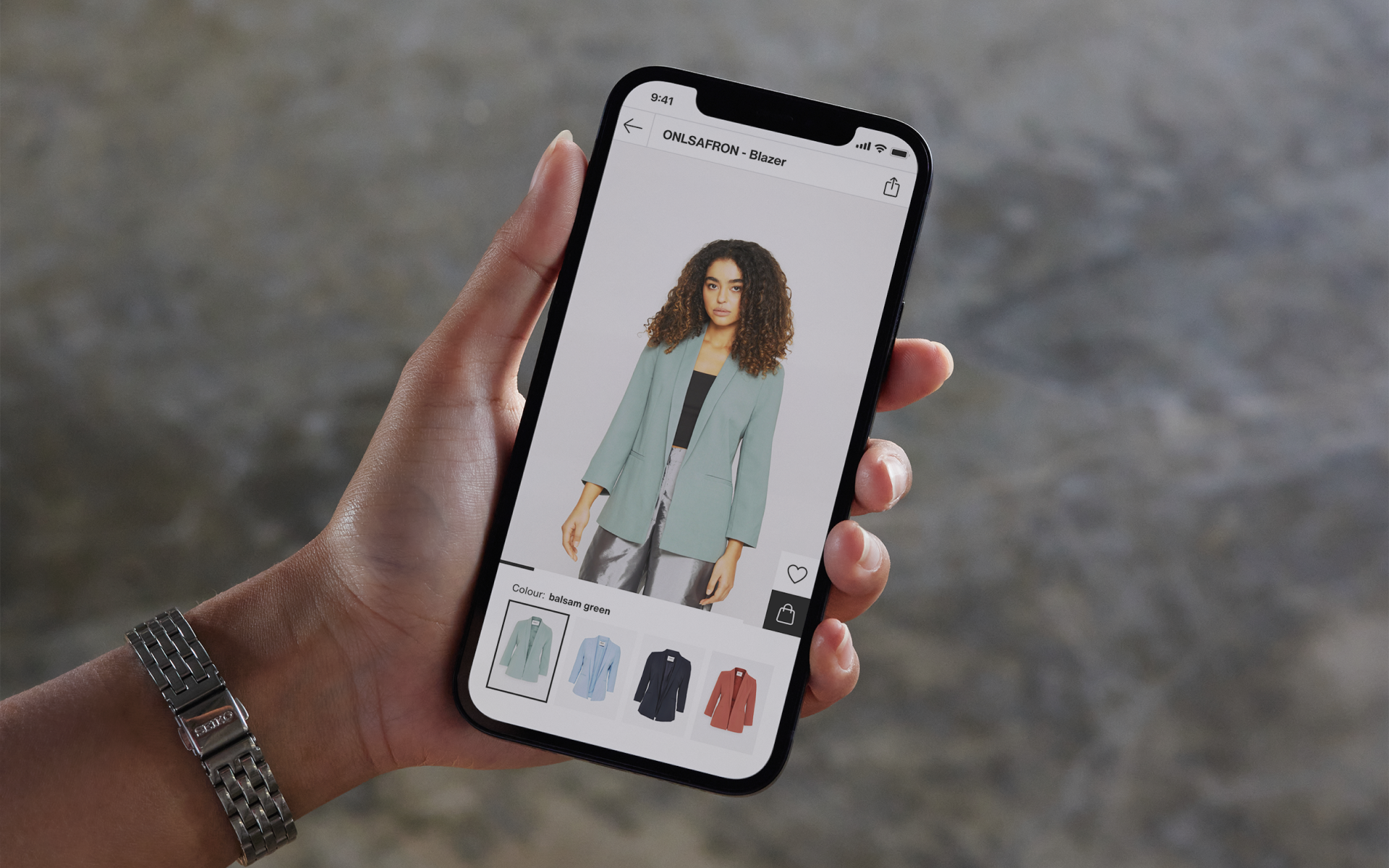
To match the new Zalando visual language; we updated the typography and colours at the same time as replacing the often missed colour picker from the old app, with the more easily discovered component on the .com experience.
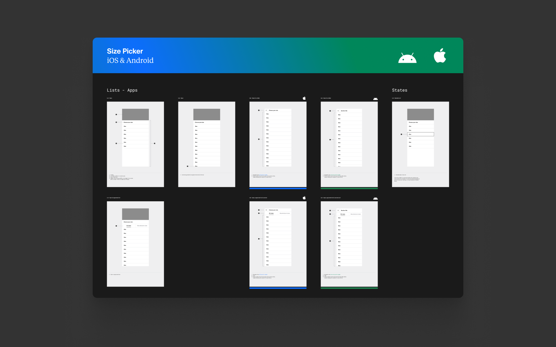
We also changed the size selection component to match the .com experience, bringing familiarity to Zalando's mobile experiences and providing the baseline for presenting complex sizing and pricing information.
Continuity
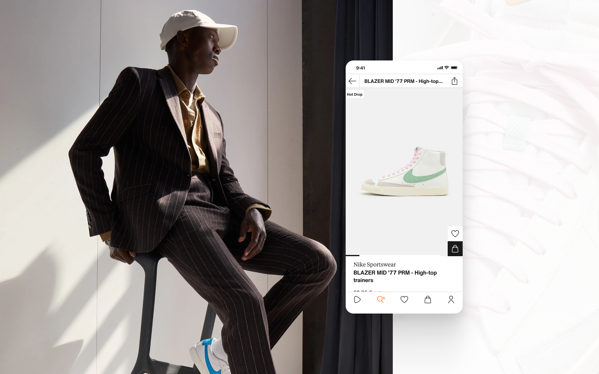
Reflecting on the design direction, a lot of small changes contributed to a significant impact on the look and feel of Zalando from home page to catalogue pages to the PDP. Zalando now had a coherent brand language translated successfully to the core user experience without overshadowing brands on the platform at the same time.
The app and web user experiences were now more aligned than ever, offering customers a seamless multi-platform experience when shopping on Zalando. While we know that we could leverage the power of native apps more in the future, what we learned from the web experience gave us confidence to set a foundation for later experimentation. Building the continuity into all touch points would allow us to test new features on platforms independently and know what did and didn’t work with a clear baseline to fall back on.
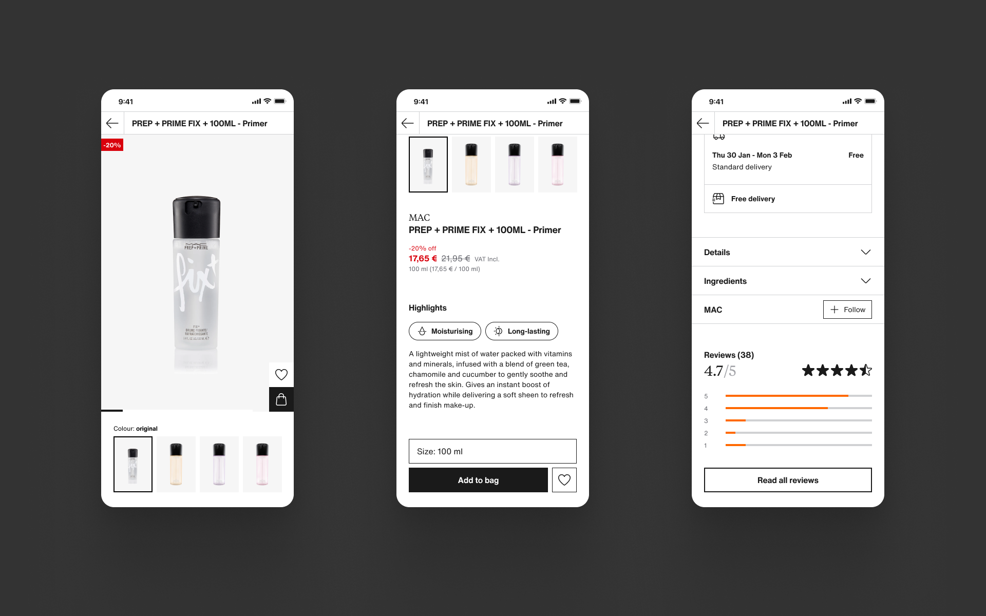
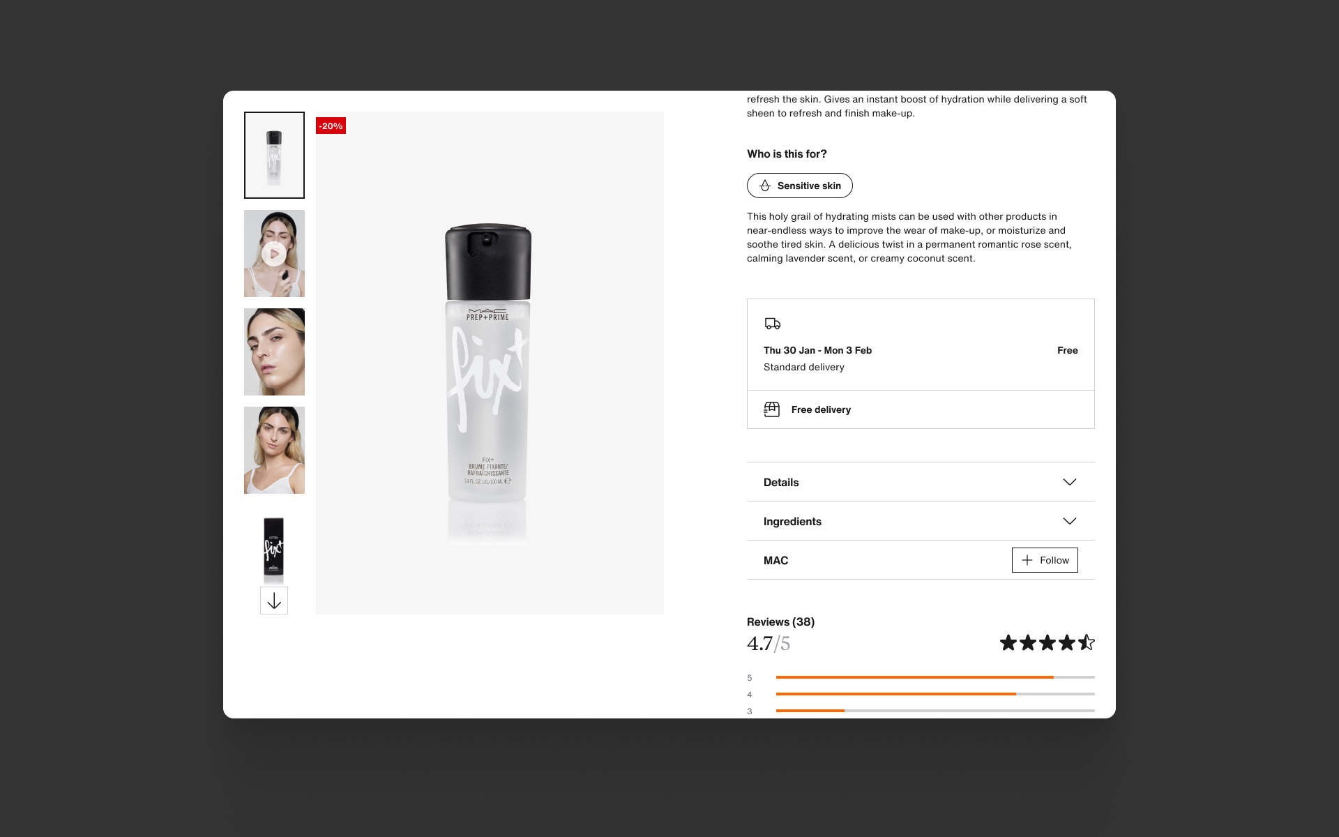
We also know that we could still do more to leverage our category expertise and be seen as industry experts rather than just another retailer. Zalando presents products in an almost agnostic way, with only beauty and accessories having some clear distinction on PDP by way of product presentation. We knew that we could do a lot more here, and really build on the experience we created with Weave to be more personal, category specific and trusted as a result.
Specs & docmentation
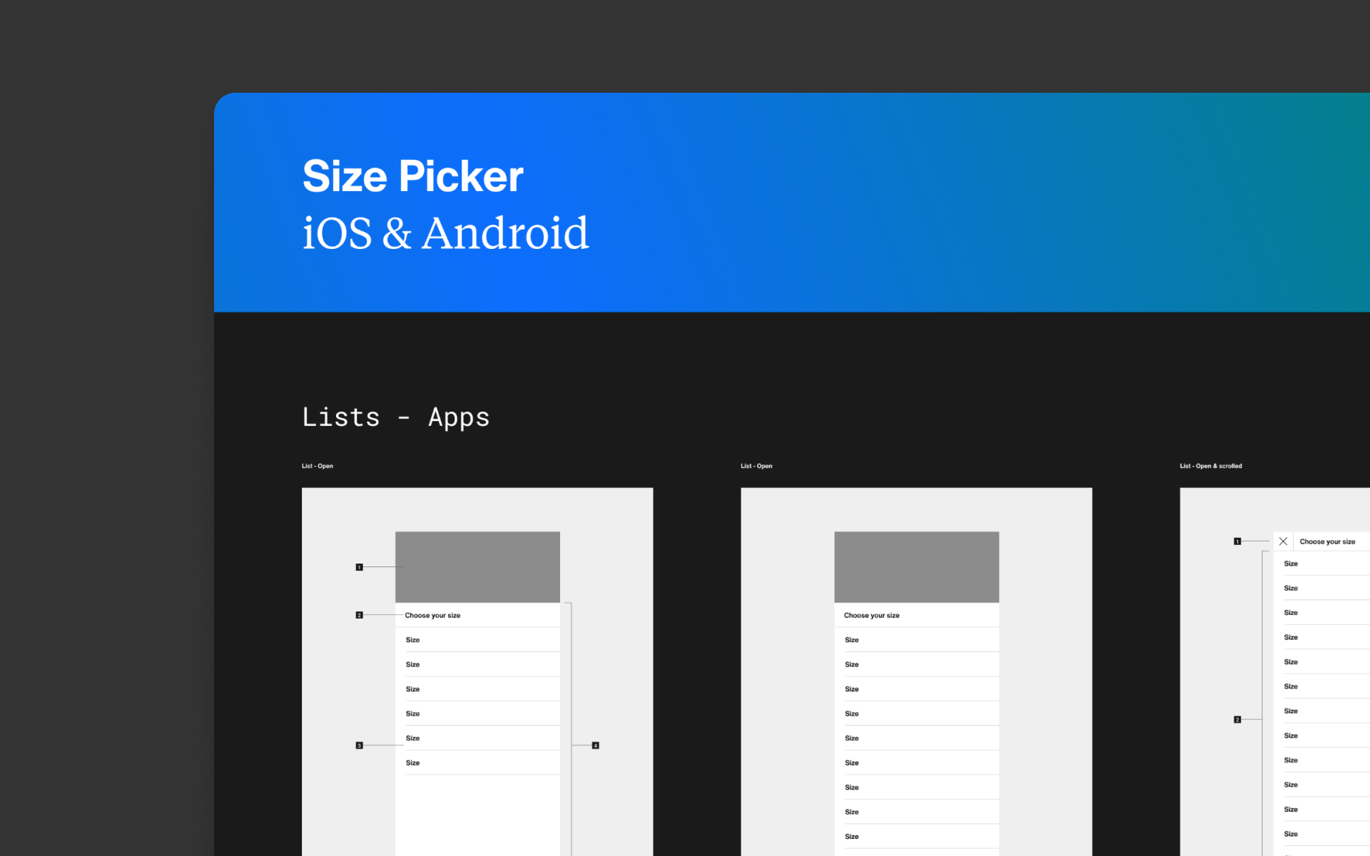
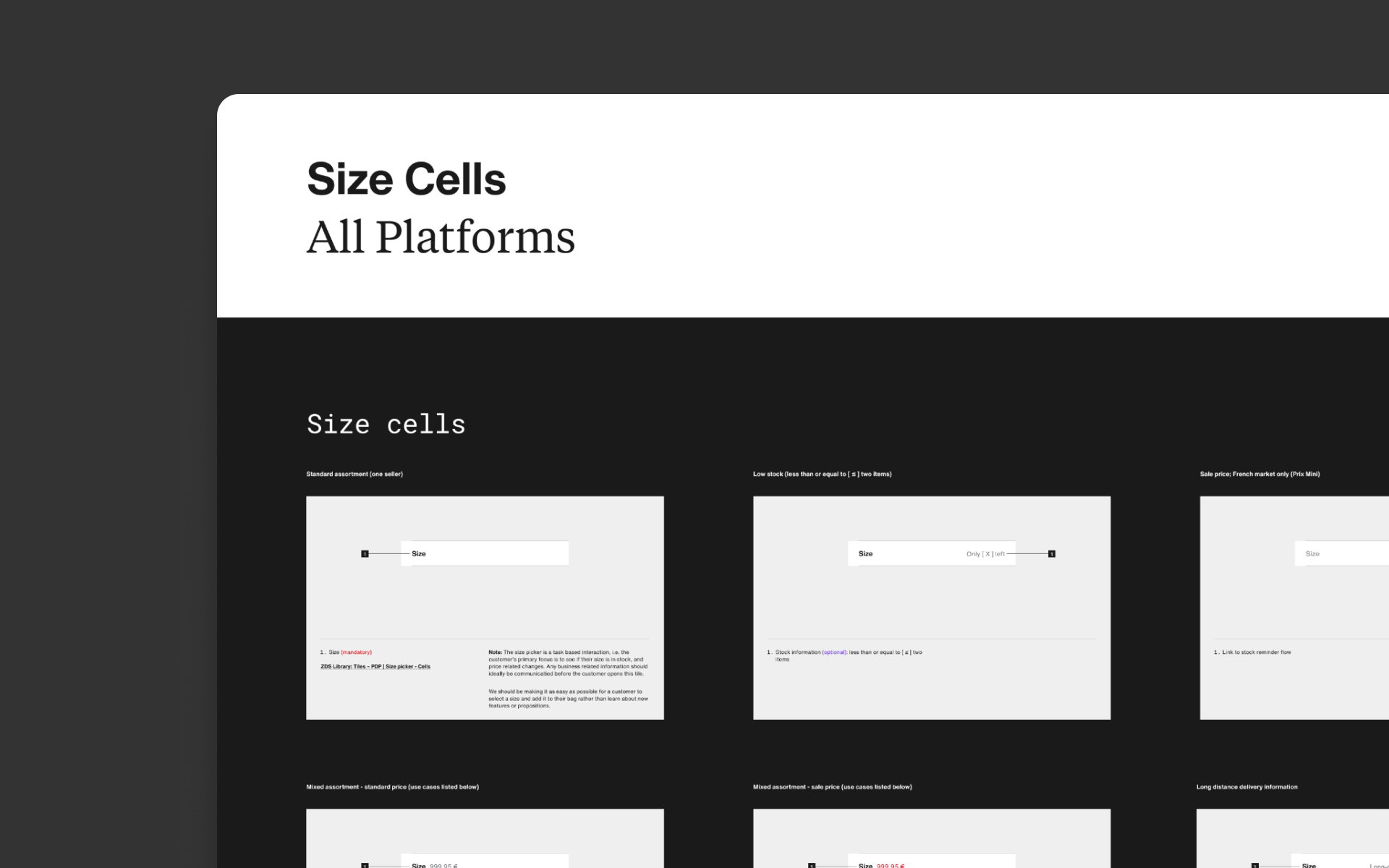
Often overlooked, but no less important, I worked with the Zalando Design System team (ZDS) and our own product team engineers to deliver fully documented and specified designs that could easily be used by other designers outside the PDP team. While the development process itself was more ad-hoc, I had rough documentation ready in the agile development cycle so the more deliberate documentation didn't slow things down.
Wrapping up
This project was delivered with incredible levels of collaboration and support from the Zalando design, product and development communities. Starting from an idea about how to connect more emotionally to our customers, Weave has grown into a company wide initiative to make Zalando the starting point for fashion where I led the design effort for the PDP. From the initial concept and metaphor of "The Label", we were able to build on the already successful PDP templates and add greater coherence by consolidating the app and web experiences.
Now that the foundation has been set, we knew we could still improve on product presentation and helping our customers choose the right product for them. Becoming known as experts at a category level was our next goal, directly addressing the most common return reasons outside of sizing. Customers when returning products often told us that the product details did’t quite match the images, and when they receive their items they are sometimes dissatisfied.
This project allowed us to explore category specific experiences so that Zalando might be seen as an expert rather than a generalist. The foundation built on top of the new design direction created the perfect opportunity to start investigating how different tiles could be personalised to be more specific to a category.
